The Valentine Animation
The Brief
For this project, we had the task of working in small teams to produce a one-minute animation in response to a novel by Thomas Hardy. We were working with Wessex Museums on this project and they wanted us to produce the animations for their upcoming Hardy exhibition.
The exhibition aims to make Hardy more human, so our job was to make his work more relevant, introducing his work to younger audiences. But we also had to ensure we didn’t alienate their existing audiences, so the animations had to appeal to all.
The animations were expected to be a conceptual and creative response to the given text, expressing our interpretation of Hardy’s world and ethos.
Team: I completed this project with Molly Pincombe, Jemima Worley-Smith and Molly Wright.
Research
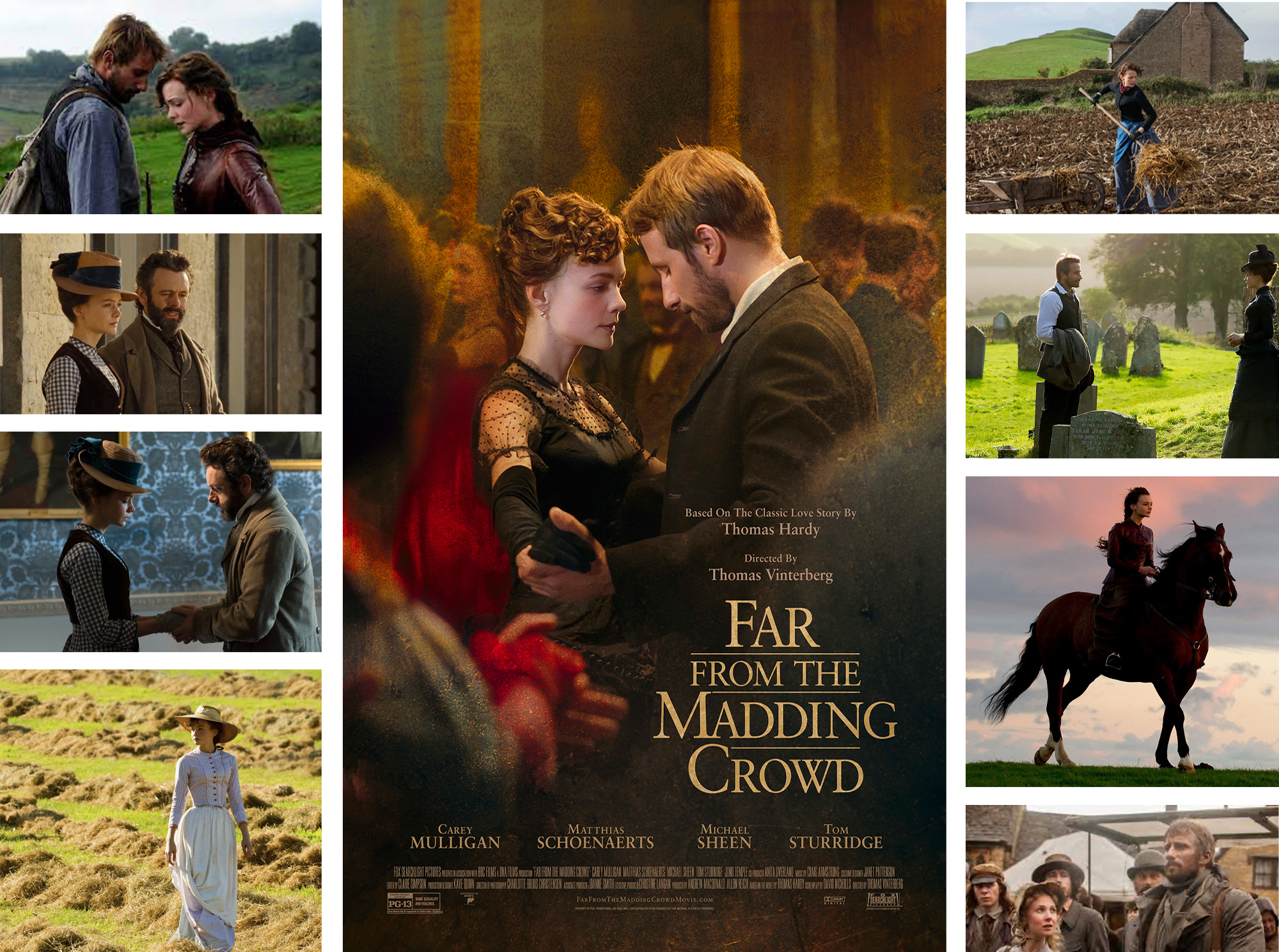
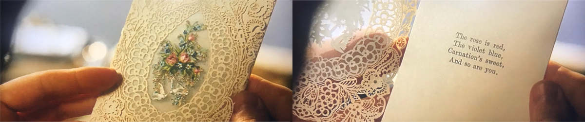
We were given the Thomas Hardy novel- Far from the Madding Crowd to create our animation in response to. We started off the project by doing some research into the story, we read up on multiple websites explaining what happens in each chapter. We also watched the 2015 film of Far from the Madding Crowd to help us understand the story better and to get an idea of the scenes. This also helped us to think of ideas to form our concept for the animation. We found the visuals really inspiring. You can see a mood-board of screenshots from the film to the right.
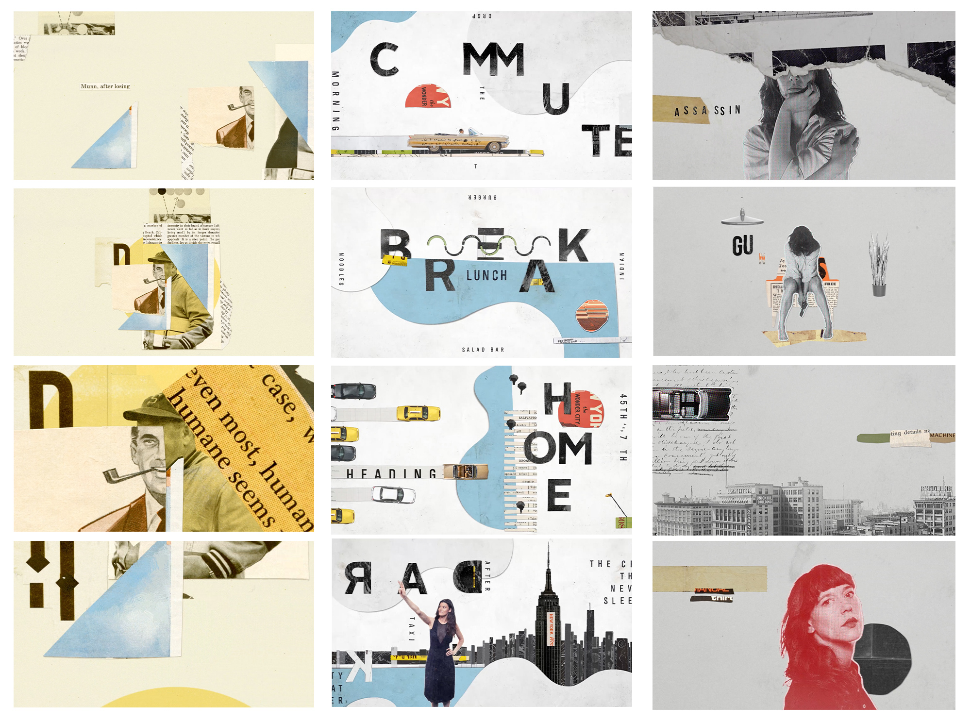
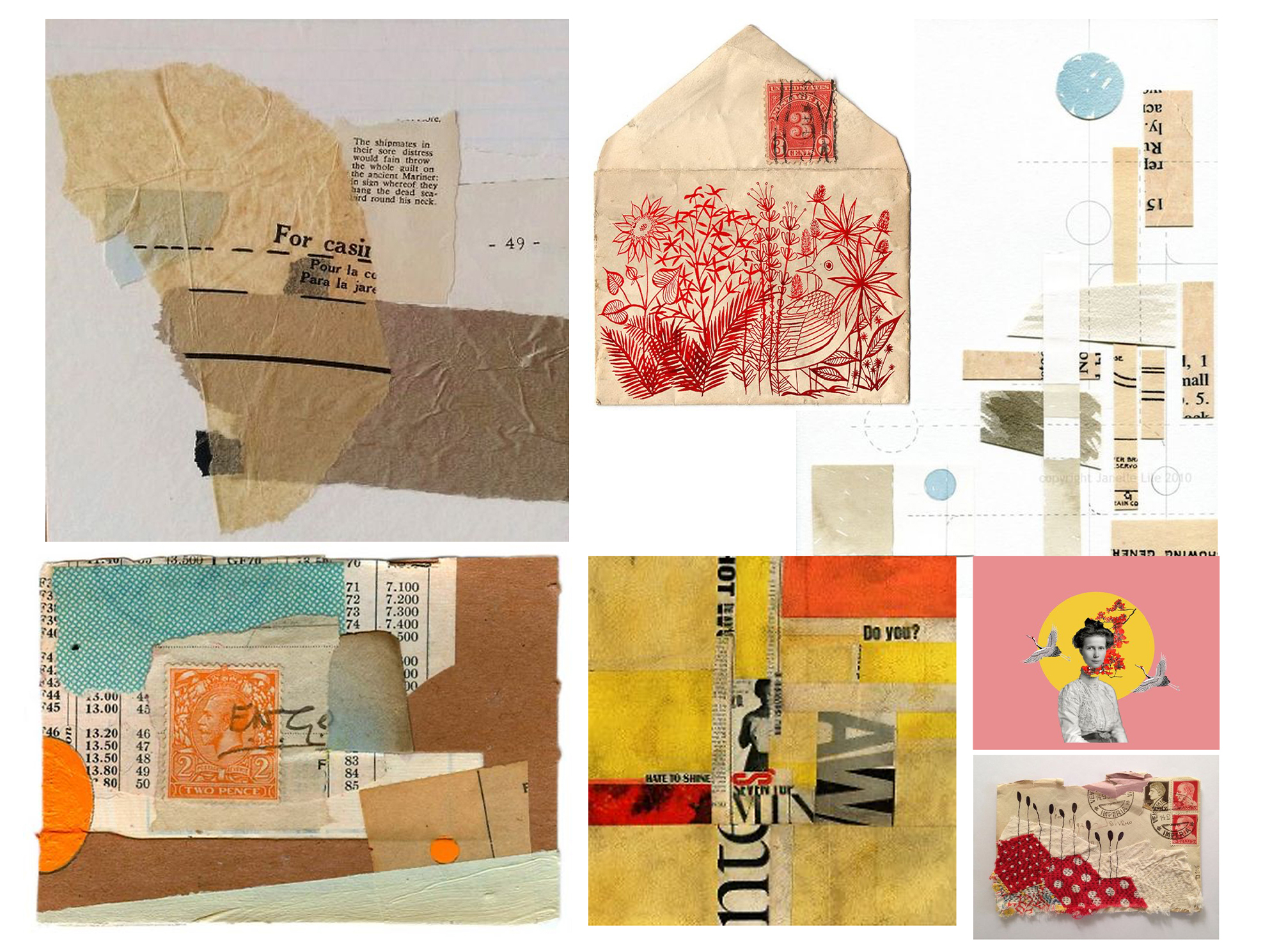
We then did some style research. We looked into existing animation styles to get an idea of what we wanted ours to look like. We came across some really cool stop motion examples and we knew straight away that this was what we would be interested in doing for our animation. We created some mood-boards of examples that particularly inspired us, which you can see below. I thought that a collage style using scraps of paper could work particularly well. I made another mood-board of different collage examples, which give off an almost Victorian style, matching the era that the novel was set in.
Click here to see some of our further research on Thomas Hardy and Far from the Madding Crowd.
Workshops- Flip Books
Throughout the project, we had a variety of in-studio workshops which helped us to widen our knowledge about motion graphics and to inspire us with new ideas. The first workshop looked at the very basics of animation where we were shown a range of flip books and we even had the fun task of making our own. I focussed on making a ball bounce across the page. Although a fairly simple task, it was also a challenge to make the movements look realistic.
Workshops- Storyboarding
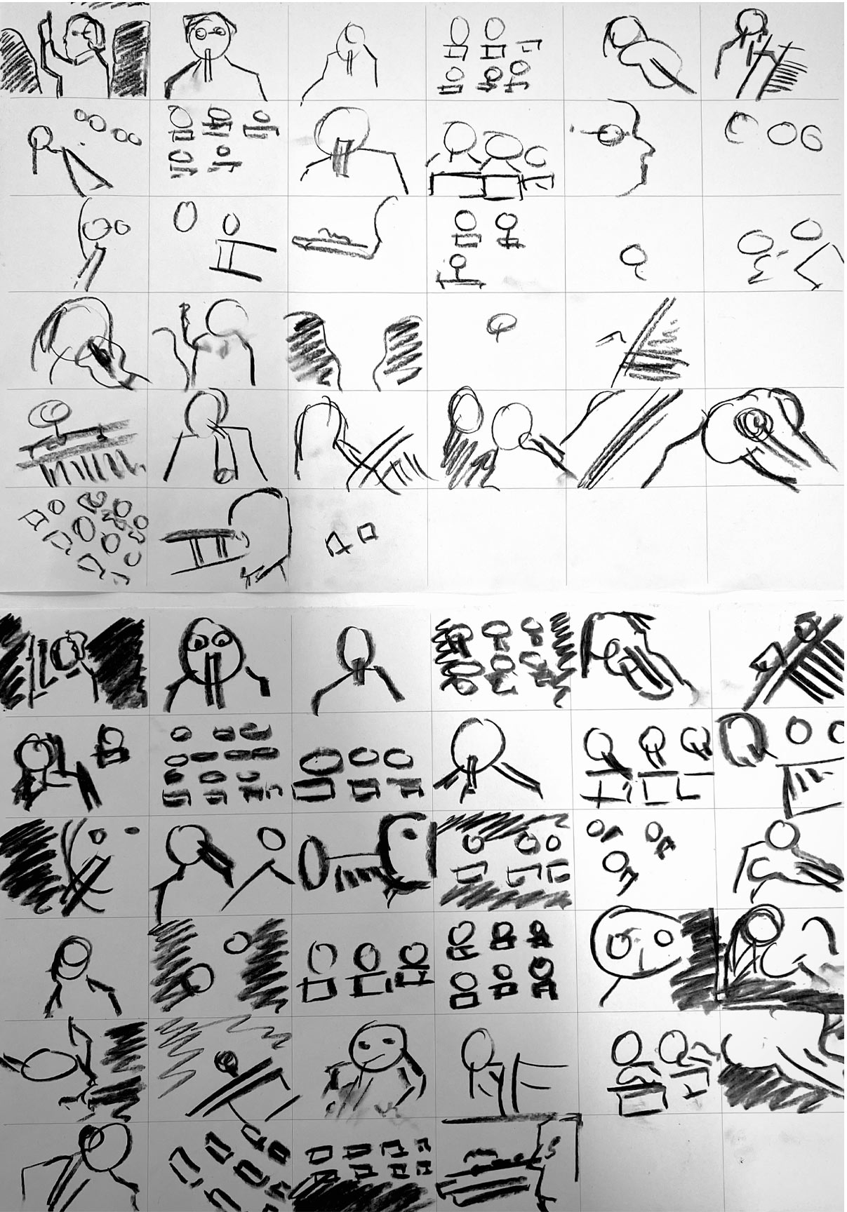
Following the flip book part of the workshop, we also had a storyboarding exercise. We had to quickly sketch out as many frames as we could using charcoal whilst watching a video of an orchestra performing (“Michael Nyman- Chasing Sheep is Best Left to Shepherds”).
We had two attempts to draw as many different movements as we could, at first I thought this was quite a challenge as drawing really fast was quite out of my comfort zone but I found this a particularly useful exercise in helping me to not be so precise and precious about my initial sketches and it taught me that if you draw quickly, you can end up generating a lot more ideas in a short space of time without thinking too much into every little detail. It was also useful to think about different types of camera angles to keep the viewer constantly engaged in the animation.
Our Concept
After doing heavy amounts of research into “Far from the Madding Crowd” and also having watched the film, a scene that really stood out to us as a group was the Valentine’s scene when Bathsheba sends Mr Boldwood a Valentines Card. We thought this scene could have a lot of potential. We decided that we wanted to go with a feminine approach with our animation to symbolise Bathsheba’s power as a female in the novel and how she goes against the typical standards for women in the Victorian Era by not wanting to get married since she already has money of her own.
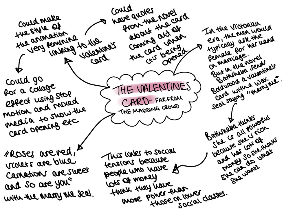
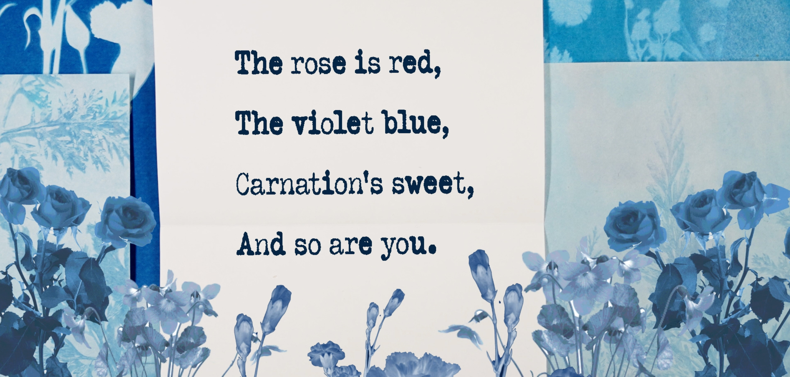
I created a mind-map (to the right) based on the Valentines scene in the novel and how it could be turned into an animation. In Bathsheba’s Valentine’s card, she writes a short poem;
“Roses are red, Violets are Blue, Carnation’s Sweet, And so are you.”
We thought we could go for a conceptual approach by basing the animation on this poem and extending it to symbolise Bathsheba even further. I really liked the idea of producing the animation in a collage style effect using small scraps of paper moving across the screen (similar to our style inspiration mood-board), making it look homemade just like the Valentine’s card was. Although we wanted to go for a conceptual approach, we wanted the animation to have clear links to the novel itself.
One of the themes of the novel was 'social tensions'. Another reason we decided to go with the Valentine's concept was because the feminine approach heavily links to social tensions in the Victorian era. The card Bathsheba sends is sealed with a wax seal that says 'Marry Me'. During this era (and still today), men would typically ask for a woman's hand in marriage but Bathsheba goes against this expectation by proposing herself. Bathsheba felt that she could send the card because she has a lot of power.
Storyboarding
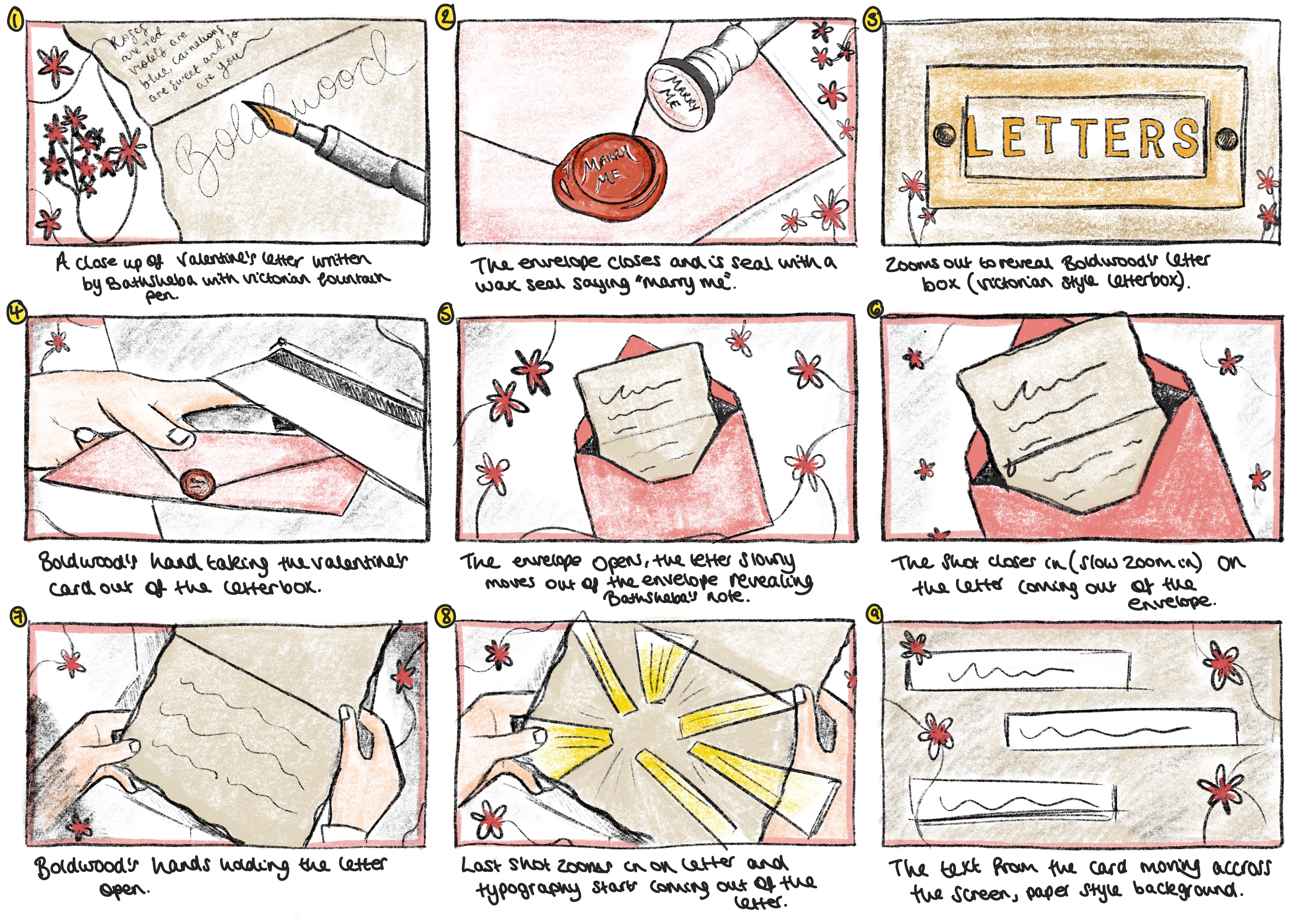
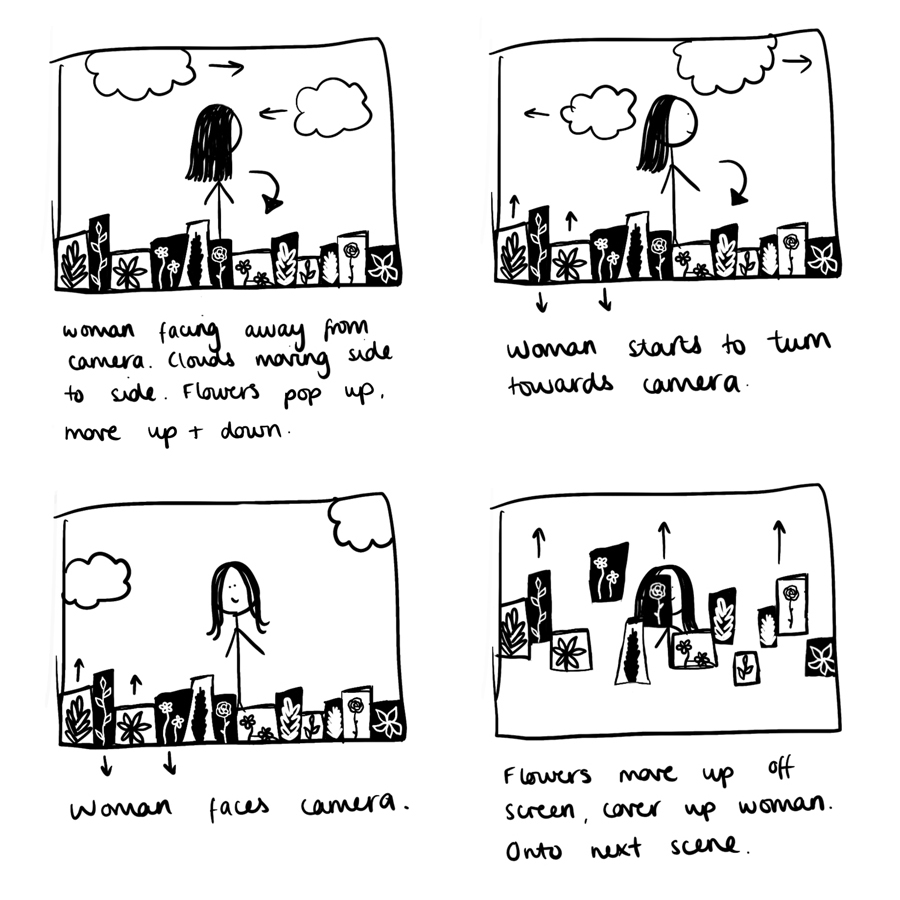
After we had decided on our overall concept, it was time to start developing storyboards of our ideas to help visualise the theme and bring it all together. I took the task of storyboarding on myself and I produced the storyboard below which shows the card being written and then sent and then being opened by Mr Boldwood. I drew flowers in every frame to represent our feminist theme and to symbolise Bathsheba’s power in the novel. I was happy with the outcome of this initial storyboard, I felt that the colours I chose really helped to represent our theme and style we were going for and clearly showed what was happening from start to finish.
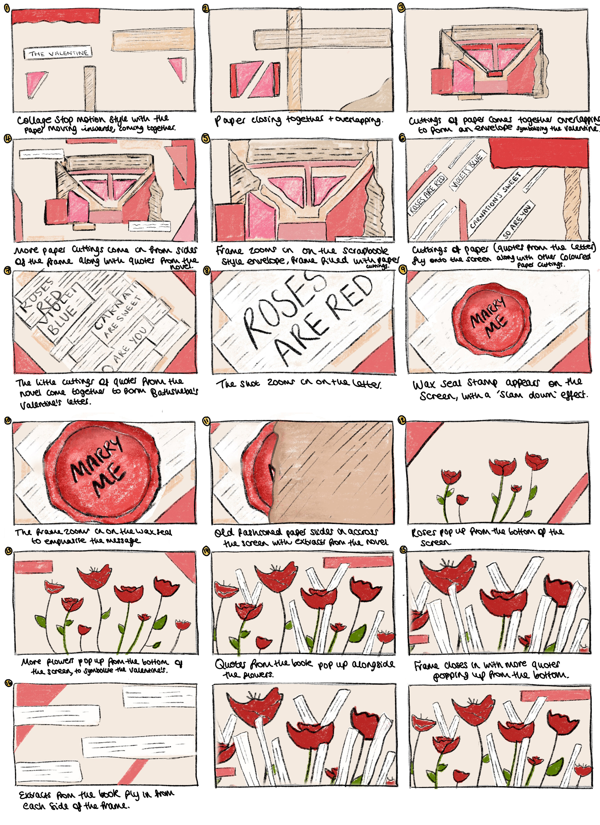
The second storyboard below was also drawn by me. I drew this in a style that represents the collage/scrapbook idea that we intended to go for, showing how small pieces of paper will come towards each other to represent the Valentine’s card. We had the intention that the whole animation would be produced by hand with paper cuttings to give it that traditional, handmade feel. Then we intended to make minor edits digitally afterwards.
Animatic
Our animatic was put together by Molly P using the storyboard that I drew. It was useful to see how the scenes fitted together with possible sound effects and music. We had the intention of having some light-hearted music in the background along with some paper sound effects and we thought this matched up well with our animatic. It was good to see our ideas come together a little more and this encouraged us to start producing test animations.
Test Animations
After the animatic I decided to produce some test animations. I played around with using stop motion and moving collage materials such as different papers, pressed flowers and envelopes around the screen. I found this a fun process and came up with some pretty interesting outcomes.
To the right you can see a test animation that I made by myself using stop motion and then I took it into After Effects to add digital animation to give it a mixed media blend. I think the added animation on After Effects makes it come alive nicely. I spent the whole day creating a range of different stop motion tests which you can see if you click on the link below.
Click here to see my further animation tests and experiments.
Our Challenge
Around midway through the project we had a crit with our tutors and Harriet from Wessex Museums where we presented our ideas so far and showed them our test animations. Although everyone really liked what we had done so far, we were told that our test animations were slightly too “lovey-dovey” and “romantic” and in the story the Valentine’s Card is actually quite twisted and although Bathsheba sends it, she doesn’t actually want to marry Boldwood. She almost sends it as a prank and it’s not quite a love story like it seems. However, we only really focussed on the ‘love’ aspect of the novel in the test animations so therefore the real story got quite lost. We found the feedback from the crit very helpful and this made us realise that we needed to re-think how we were going to portray the concept to make it less romantic and a little darker but still keeping the feminine aspect.
Moving Forward
After the critique, we came together as a group and had a discussion about the challenge we were faced with and what we were going to do next. We were still quite fond of the collage style using stop motion. Jemima proposed to us this idea of using cyanotypes to create prints of flowers and then using these to make collages with. Although at first, we thought this might be quite a lengthy process with a lot involved, once we did some research into it, we thought the idea could work really well and we were all prepared to put the effort in. The range of blues in the cyanotypes took our concept away from the “overly-romantic” feel but we were still keeping it feminine seeing as we planned on using flowers to produce the cyanotypes.
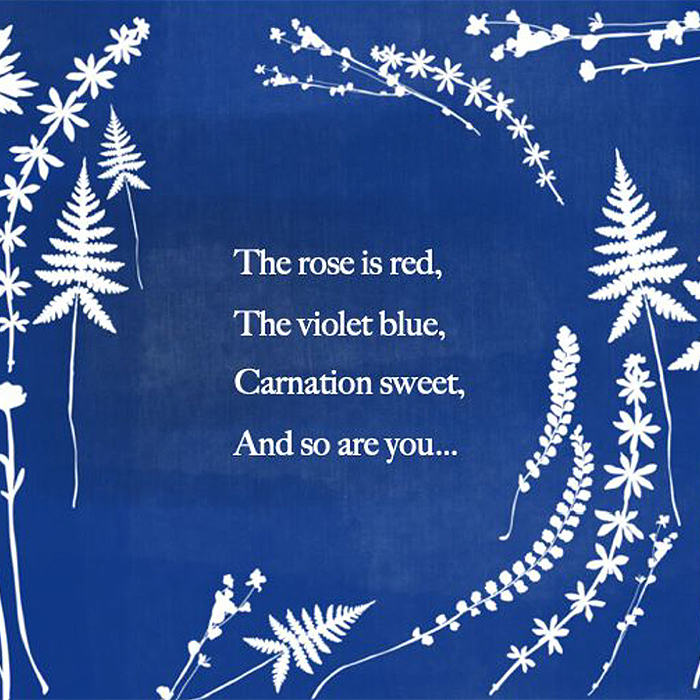
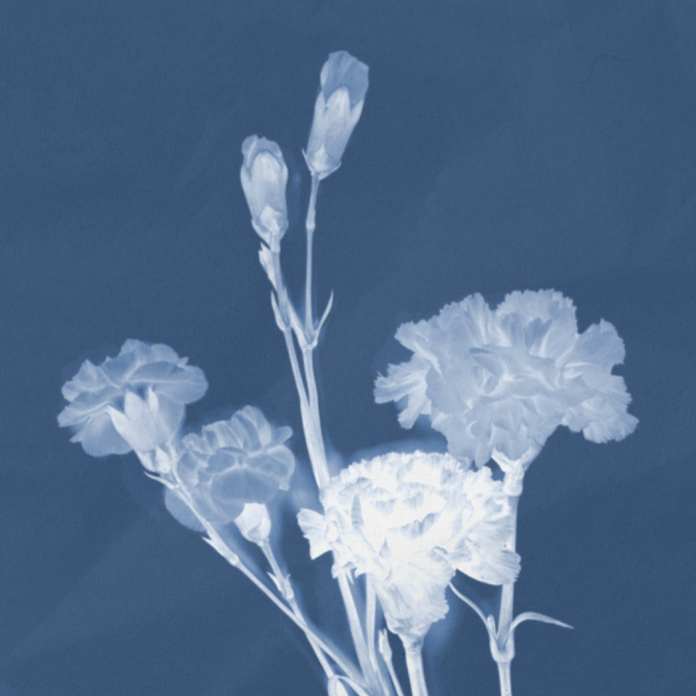
Also seeing as the cyanotypes are made using negative images- we thought that this could represent how there is more of a negative side to the story and how it’s not all quite what it seems. We created a mood-board of inspiration images that we thought our own cyanotypes could look like and seeing as we didn’t have a lot of time to produce the final animation, we knew straight away that we had to get printing our cyanotypes. The image on the right is a digital mock-up of the poem from the novel, so we could get an idea of what to make them look like.
Audio
During the project we had an audio workshop where we got to play around with recording our own sound effects. This inspired our original idea with having scrunched up paper and writing sound effects. However, after the crit we thought that we should make the audio less friendly and happy and more twisted. Harriet from Wessex Museums suggested that we could use a song that featured in the 2015 film of Far from the Madding Crowd- Hollow in the Ferns (Craig Armstrong) in the background. Molly W edited the audio for the animation by heavily reverbing and editing the song to make it almost seem creepier and not as happy.
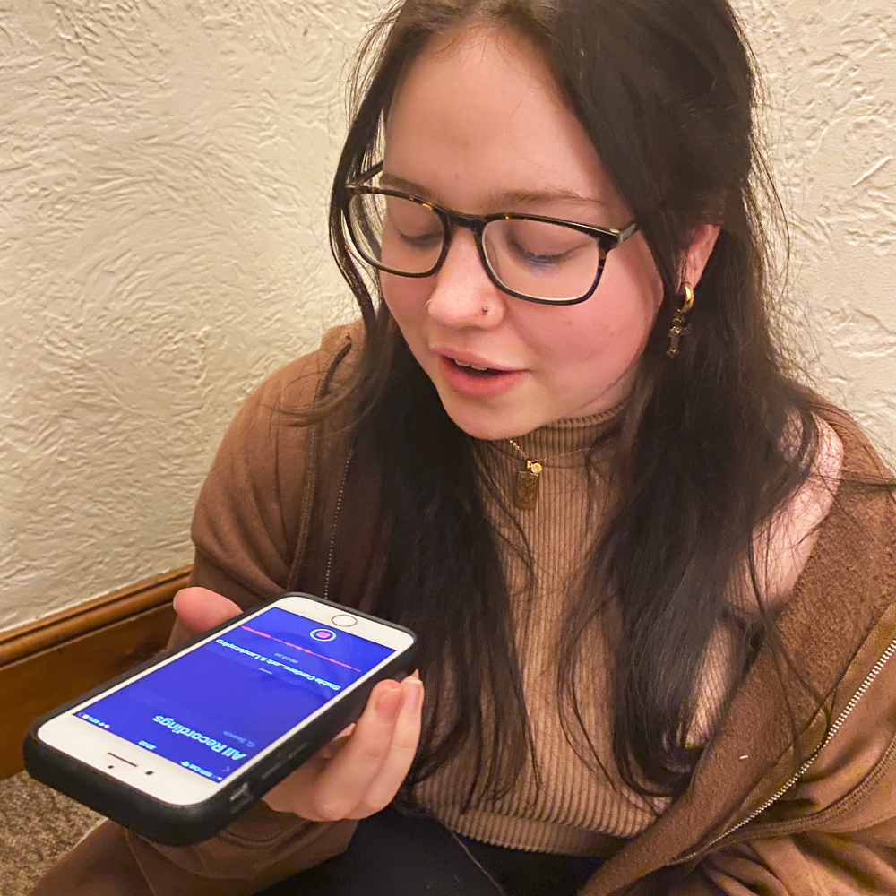
We also came to the conclusion that seeing as our animation was going to be quite abstract and conceptual, that with just the music it wouldn’t make much sense and viewers wouldn’t necessarily understand the link to the novel so we decided that we were also going to use a voice over. The Valentine poem from the novel wouldn’t have been quite long enough to fill a one-minute animation so we thought it could be a good idea to extend the poem but still have the original verse at the beginning and the end of the animation. We managed to get in contact with a student from Creative Writing who extended the poem for us but still keeping it inspired by the novel. This is what we worked with as the basis of our idea. We asked a friend of ours (Rachel Hawkins) to read the poem for our voice over.
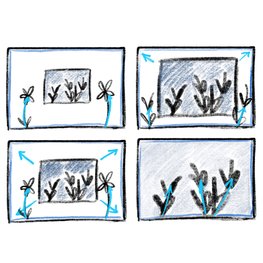
Cyanotype Storyboard
After we had decided that going with the cyanotypes was definitely the way forward, we drew out a few more storyboards so we knew what we had to do when filming the animation. We broke down the poem into four separate sections and thought about how we could portray each section separately.
To the right is a storyboard that I drew out which shows how we would have different cyanotype prints of flowers on the screen and then they would move around and reveal the envelope with the Valentine letter coming out and text appearing. I showed this to my team, and we thought this would work really well for the final animation, so we decided to follow the concept when filming. Jemima also had the idea of having a white silhouette of a woman appear in the animation to symbolise Bathsheba, so she took on the role of creating that part. We combined this with what I had drawn out in my storyboard.
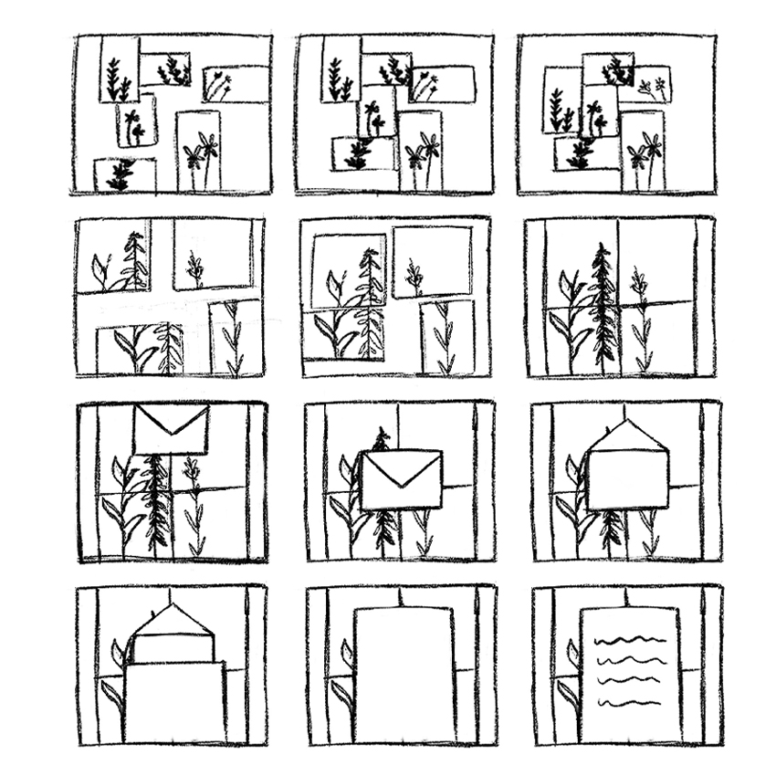
More Cyanotype Storyboards
Here are a couple other storyboards that we produced based on the new cyanotype concept. When drawing out these storyboards we still wanted to ensure that we sticked to the general order of the very first storyboard that I drew but we also wanted to make sure that it portrayed our new idea across successfully.
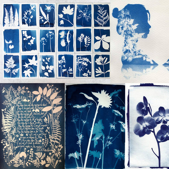
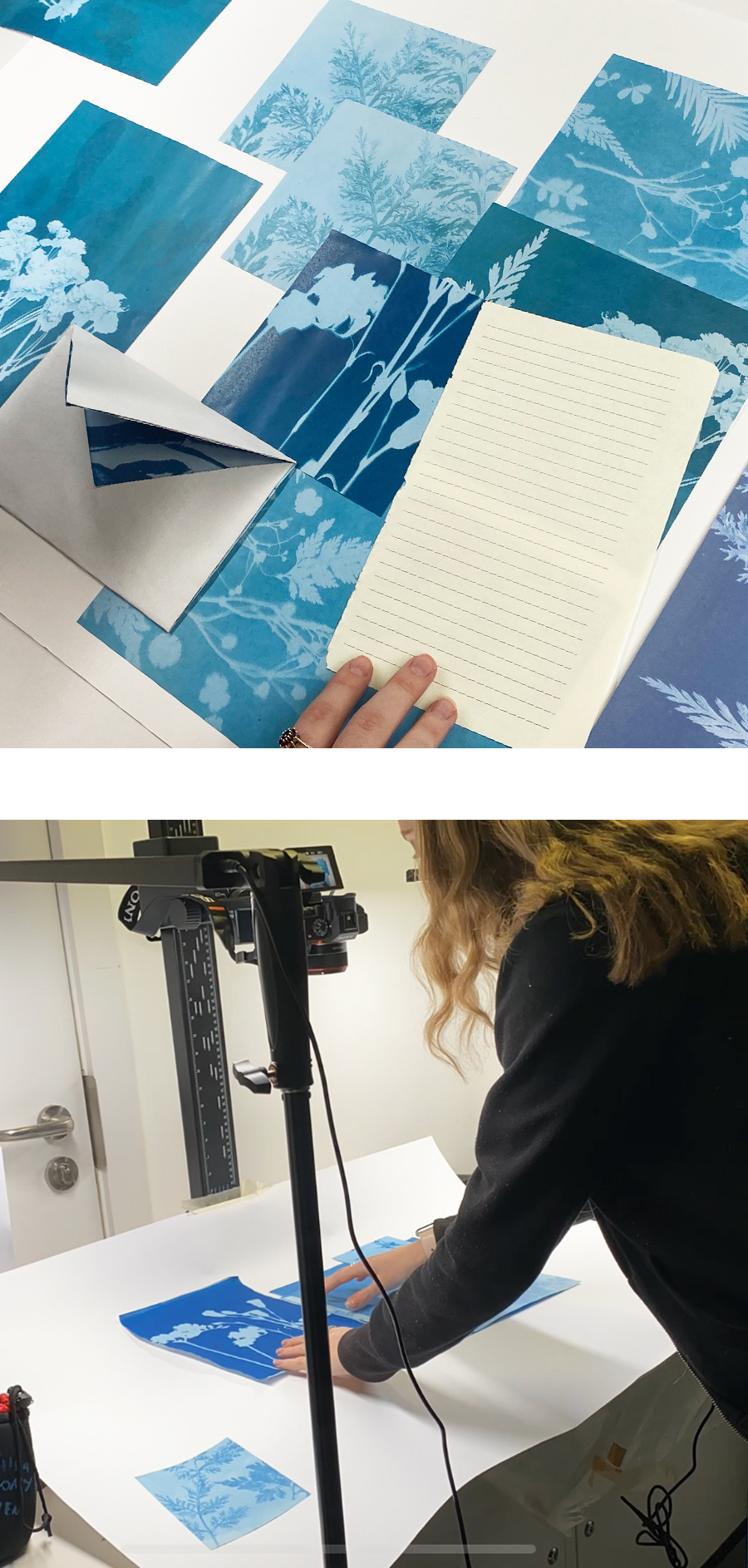
Preparing Cyanotypes For Print
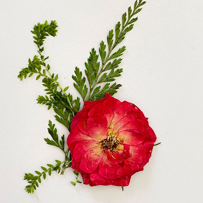
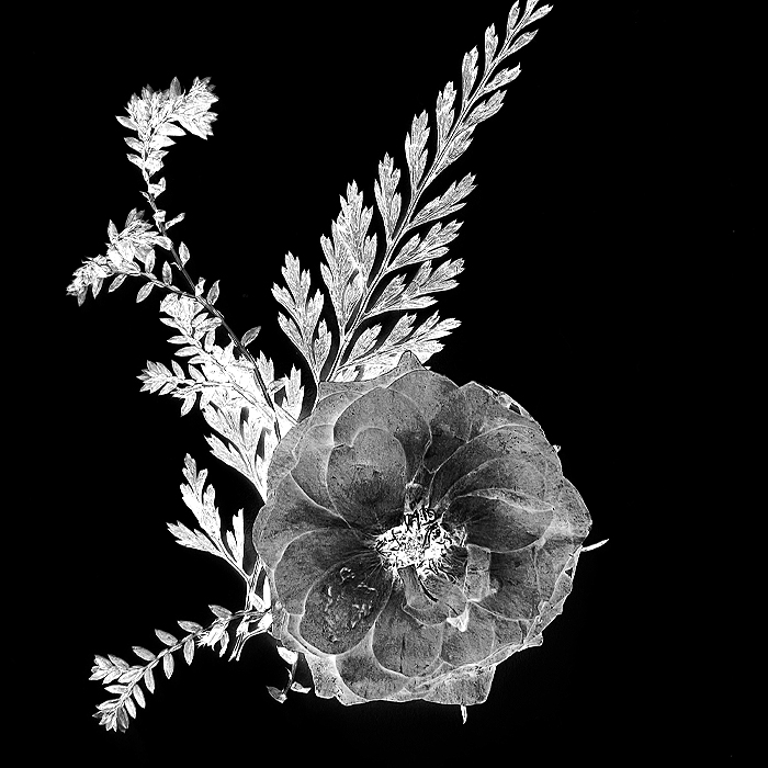
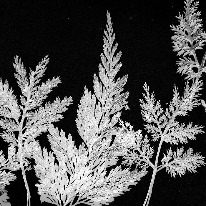
In order to make the cyanotypes from scratch, we had to buy the special paper to do it. Jemima also bought some real dried flowers which we all took photos of in different arrangements. Everyone then sent their photos of the flowers to me and I edited them on Photoshop, turning the images into negatives by inverting the colours of each one to be prepared for print. We then printed the edited photos onto sheets of acetate so we could make the cyanotypes.
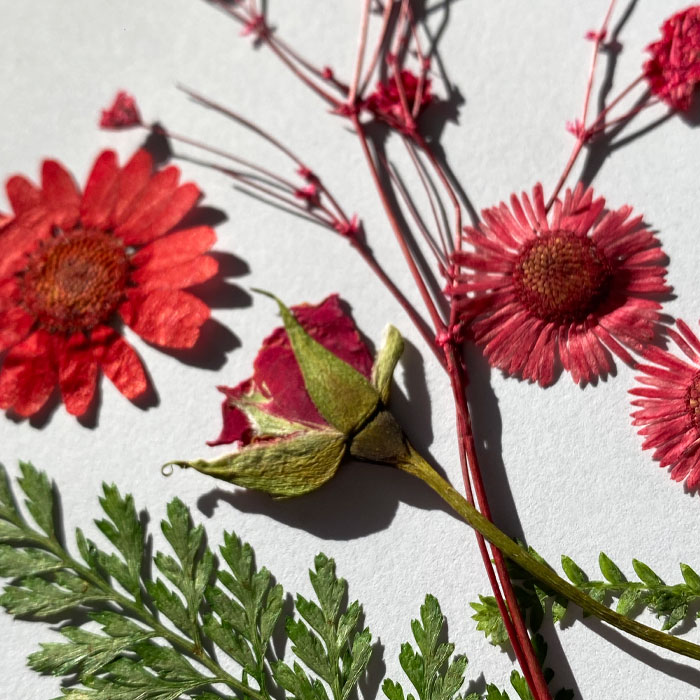
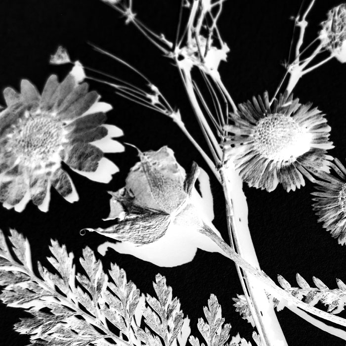
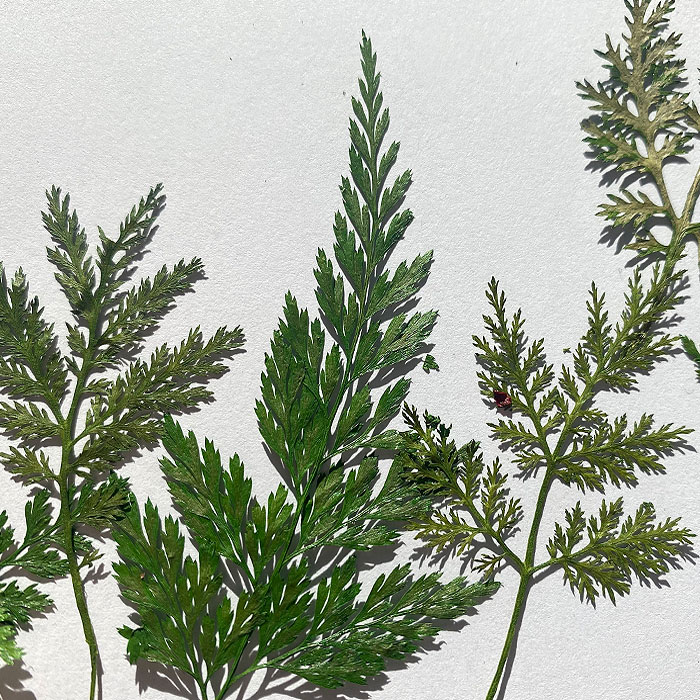
We used ferns for some of the images. This has a visual link to Far from the Madding Crowd because one of the chapters in the novel is called ‘A Hollow Amid the Ferns’ and also the song we were using for the animation is also called ‘A Hollow in the Ferns’. So the reason we included ferns in the animation was so that the true lovers of Hardy would recognise this reference.
Producing The Cyanotypes
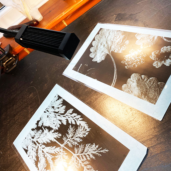
Once we had the images printed on acetate, we could make the cyanotypes for the animation. We placed the acetate over one of the cyanotype papers and then we had to leave it in the sun for around 5-10 minutes. Although we faced a challenge with this because unfortunately in true UK fashion, the weather wasn’t great when it came to developing them. The lack of sunlight set us back quite a bit and we had to re-think how we were going to do it. Luckily Molly W had a UV sun lamp, so we managed to use this to help our cyanotypes to develop.
Although the only issue was that the cyanotypes took longer to develop than they do under natural sunlight. I thought of a back-up plan and I made some fake cyanotype images on Photoshop by editing the images to make them look blue. But luckily, in the end we didn’t need to use the fake images as we were able to develop enough prints in time for shooting the animation. It took us a whole day to make all of the prints!
Creating Fake Cyanotypes

To the right are two of the fake cyanotypes that I made on Photoshop. I edited the images to make them look like real cyanotypes. I think they worked really well and look quite realistic. We actually ended up having enough of the real cyanotype prints to use, although we still used a few of the fake ones that I made in the background of the final animation.
Collection Of Our Cyanotypes
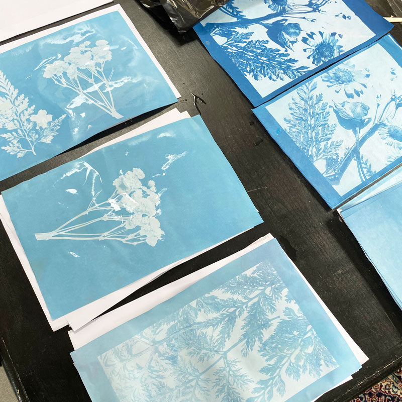
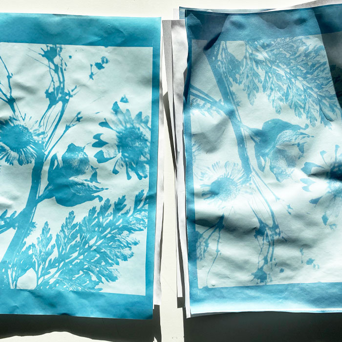
Overall, we were really happy with the outcome of the cyanotypes we had made completely from scratch. We found the whole process took a lot of trial and error, but we got there in the end. Some prints were a darker blue than others depending on how long we left them to develop but we thought this looked quite effective when all put next to each other in the final animation.
Filming Our Final Animation
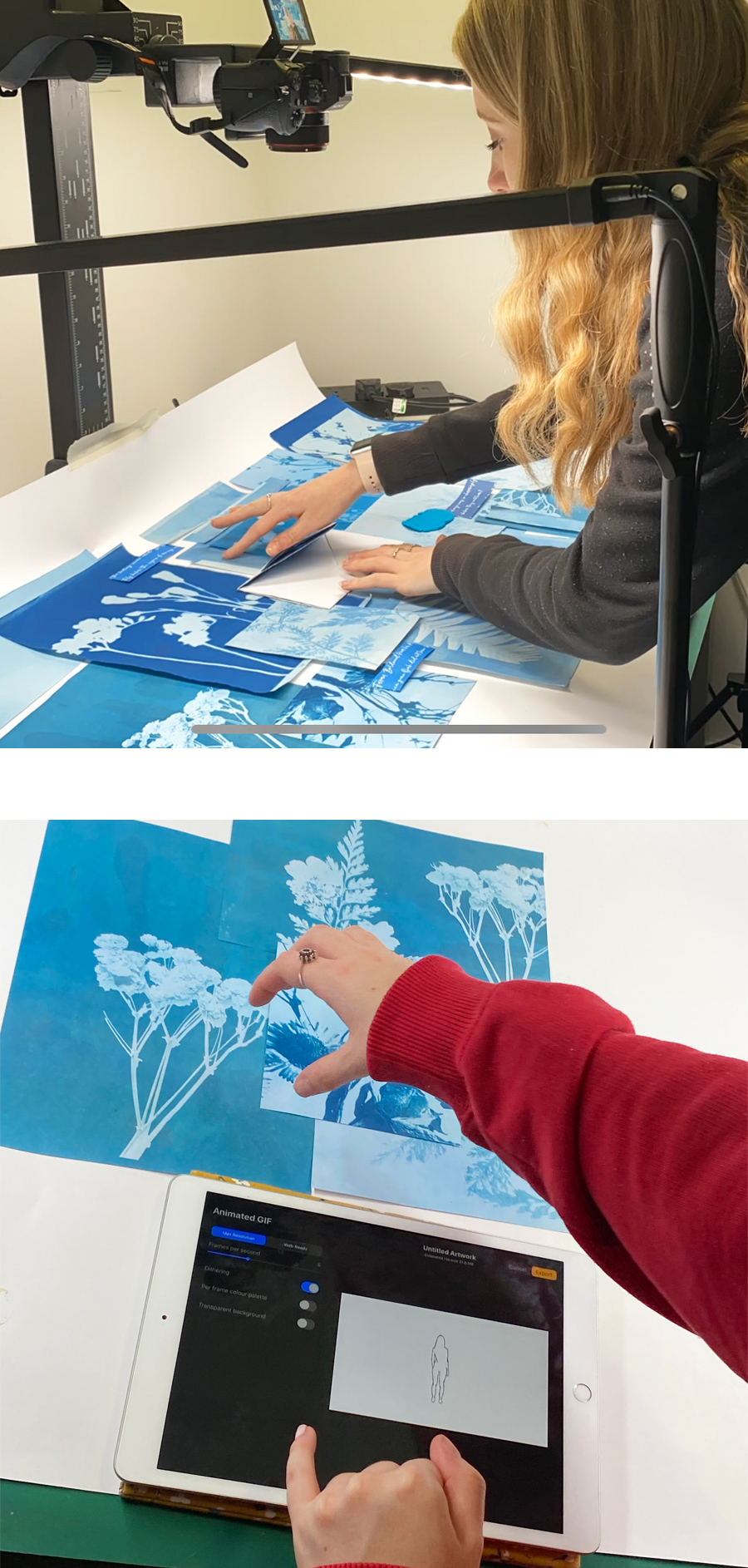
In order to film our final animation, we booked out the photography room at uni to spend the whole day filming our stop motion. We also hired a camera to take all the photos with. We ended up taking around 300 photos in total, gradually moving the paper slightly in each frame. The process of doing the stop motion went really well as we all worked as a team to get it done.
After taking all the photos, Molly W started to edit the stop motion using After Effects. She put all the photos together, with each image only being on screen for a split second making it look like a smooth video. Then after that, we added Jemima’s silhouette of Bathsheba into the animation.
Flower Drawings
Once we had finished our final animation and Molly W had put all the images together on After Effects, we thought that we could add some digital animation to create a blend of handmade stop motion and also a modern edited approach with After Effects. In our final critique, it was suggested to us that we could have some flowers popping up from the bottom of the screen throughout the animation. We thought that this would be a clever idea.
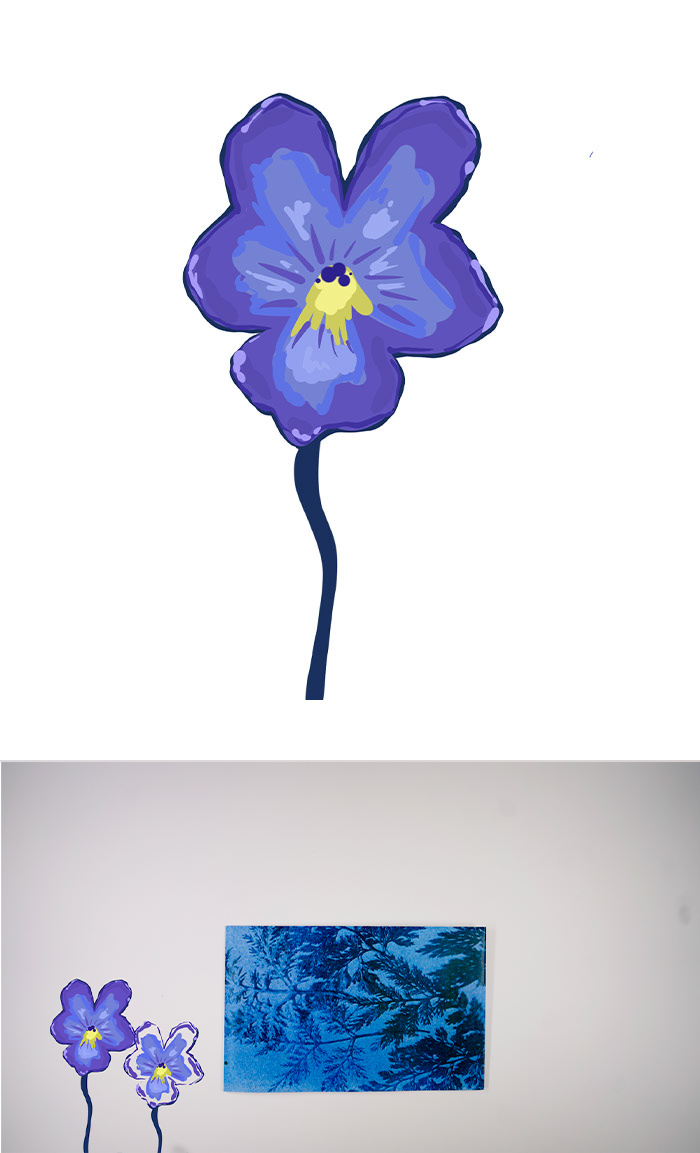
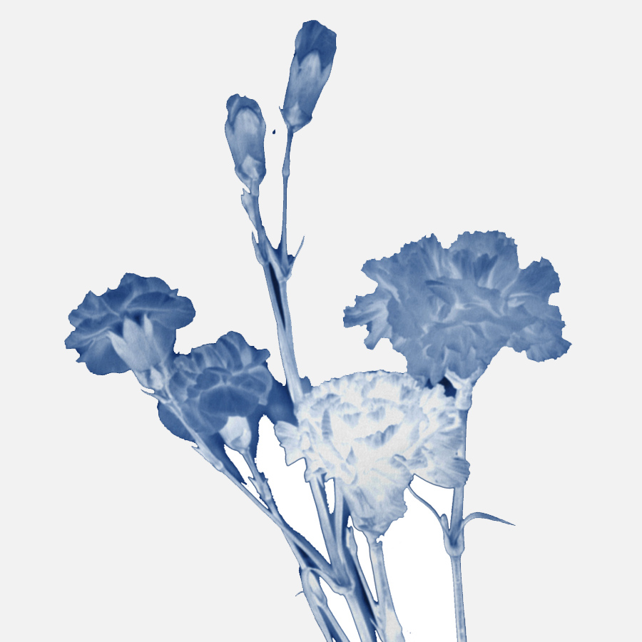
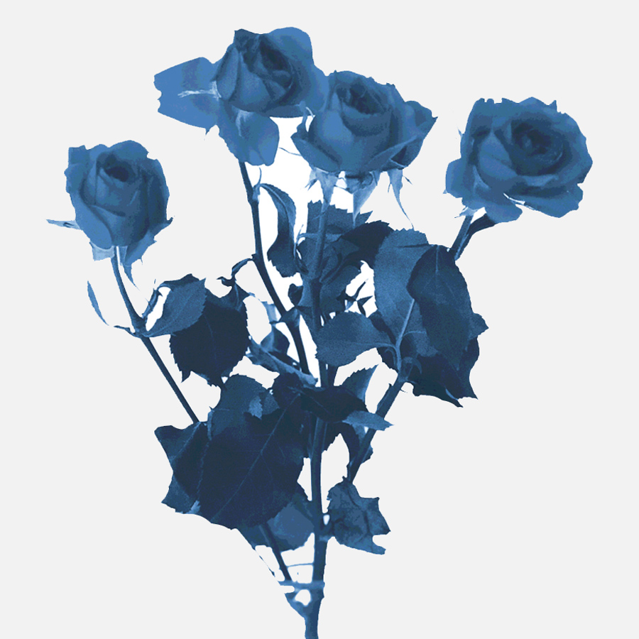
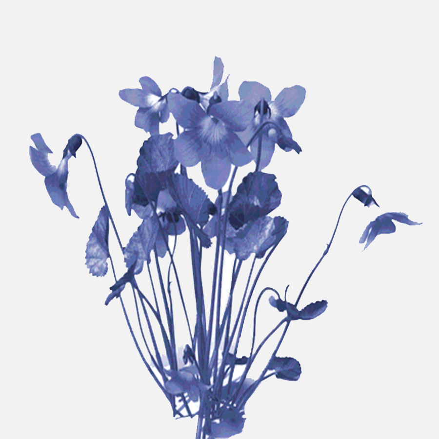
I decided to draw some flowers on my iPad that we could put in. You can see these to the right. I drew a carnation and a violet because those are the flowers that are mentioned in the poem we used. I was happy with how the drawings looked but when we placed them in the animation, the style of the drawings didn’t quite match with the cyanotypes and we felt that they looked too out of place, so we decided not to use them in the end and we had a re-think about how we could add a digital element.
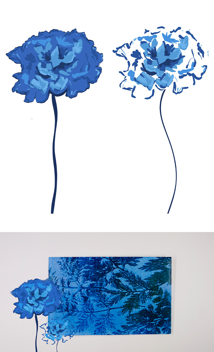
Editing The Flowers
Instead of using the drawings, we decided to just have some fake cyanotypes popping up near the beginning of the animation. I edited the images of roses, violets and carnations and then I sent them to Molly P and she put them together, making them pop up one by one on the screen. We decided that this worked much more effectively than the drawings as these matched up with our cyanotype style a lot more.
Below, you can see the photos of the individual flowers that I edited and sent to Molly P to edit into the final animation.
The Final Animation
Despite being a challenge at times, I really enjoyed the whole process of making our animation. I am very proud of the outcome we have produced, and our conceptual response is pretty unique. I like how our animation has major symbols from the novel and also has subtle links that true Hardy lovers will recognise. As a team we went through a whole journey on this project from completely changing our ideas halfway through to some of the members catching Covid right near the end, but we managed to work through every little inconvenience and create an animation that we are all very happy with and proud to share. Please see my critical reflection below the making of video.
You can watch our final animation at the top of this page.
We hope you enjoy :)
The Making of Video
While we were shooting our stop motion, we were also filming multiple time lapse videos of ourselves at work. After we finished the animation, I took on the role myself of putting together a making of video to show the behind the scenes of how we did it. I think the final outcome is really professional and gives a good insight into the whole process from start to finish. I used the original version of the song ‘Hollow in the Ferns’ in the background and this is the same song that Molly W had edited in the final animation so you can clearly see how much the song had been edited and changed from the original version. Hope you enjoy our making of video!
Music credits: Hollow in the Ferns- Craig Armstrong
Critical Reflection
For this project, we had the task of creating our own conceptual and creative response to Far from the Madding Crowd by Thomas Hardy which was to be expressed through motion. We had to work in small teams to do this and the aim of the animation was to draw the viewer into our interpretation of Hardy’s world and ethos.
Click here to read my full critical reflection for this project.