Hardy Branding and Process Book
The Brief
For this project we had to work in teams to design the branding for an upcoming exhibition about the Victorian writer, Thomas Hardy. This was a live brief set by Wessex Museums.
Team: I completed this project with Jasmine Green, Rhianna Grainger and Molly Pincombe.
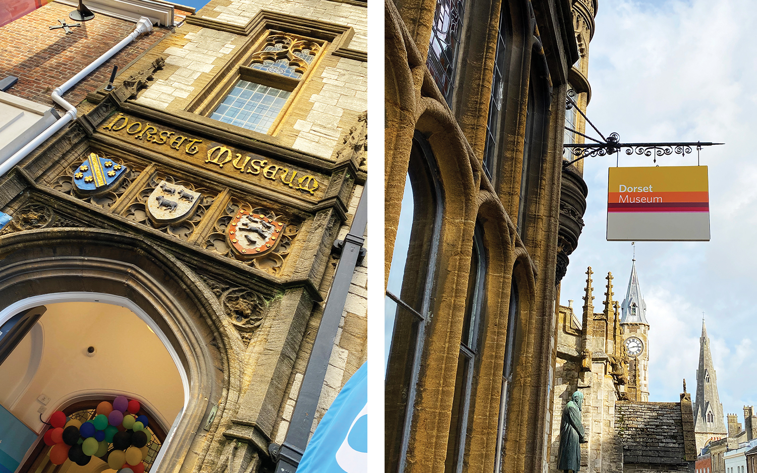
Visiting the Dorset Museum
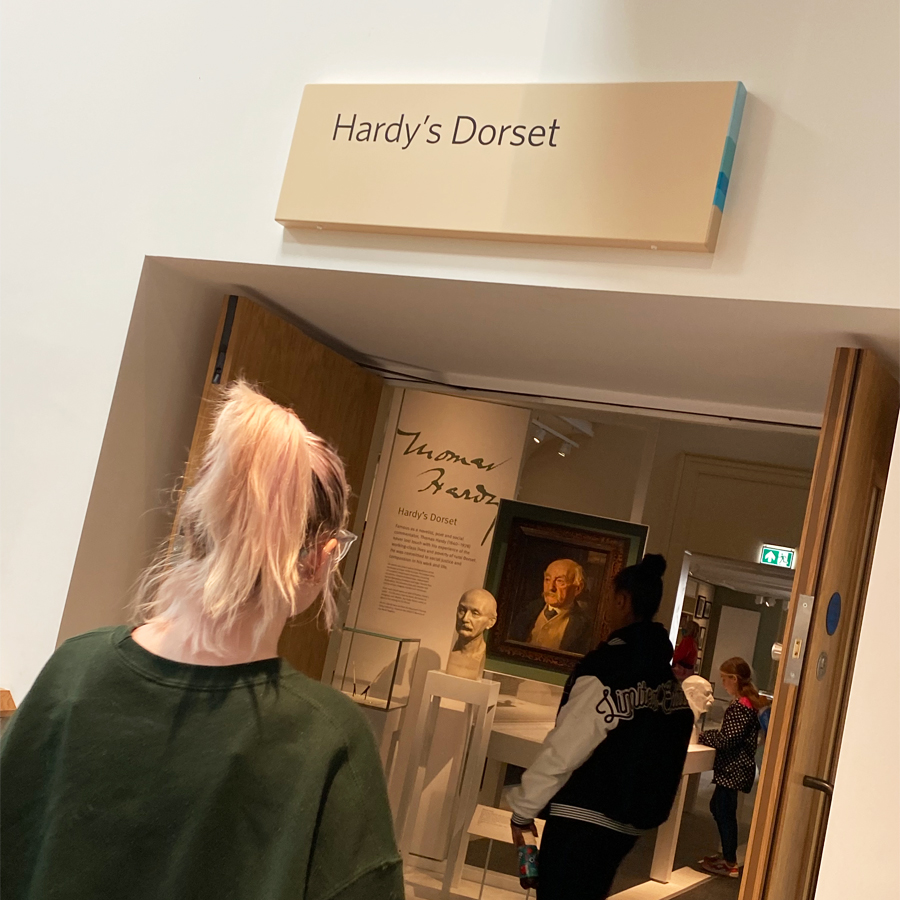
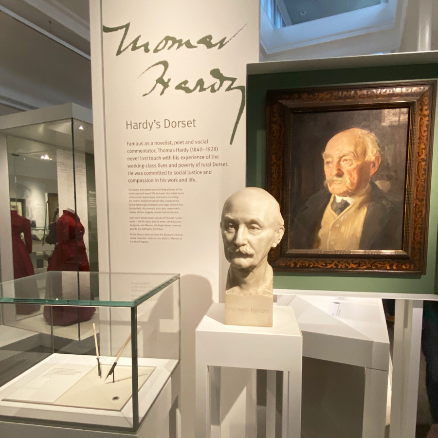
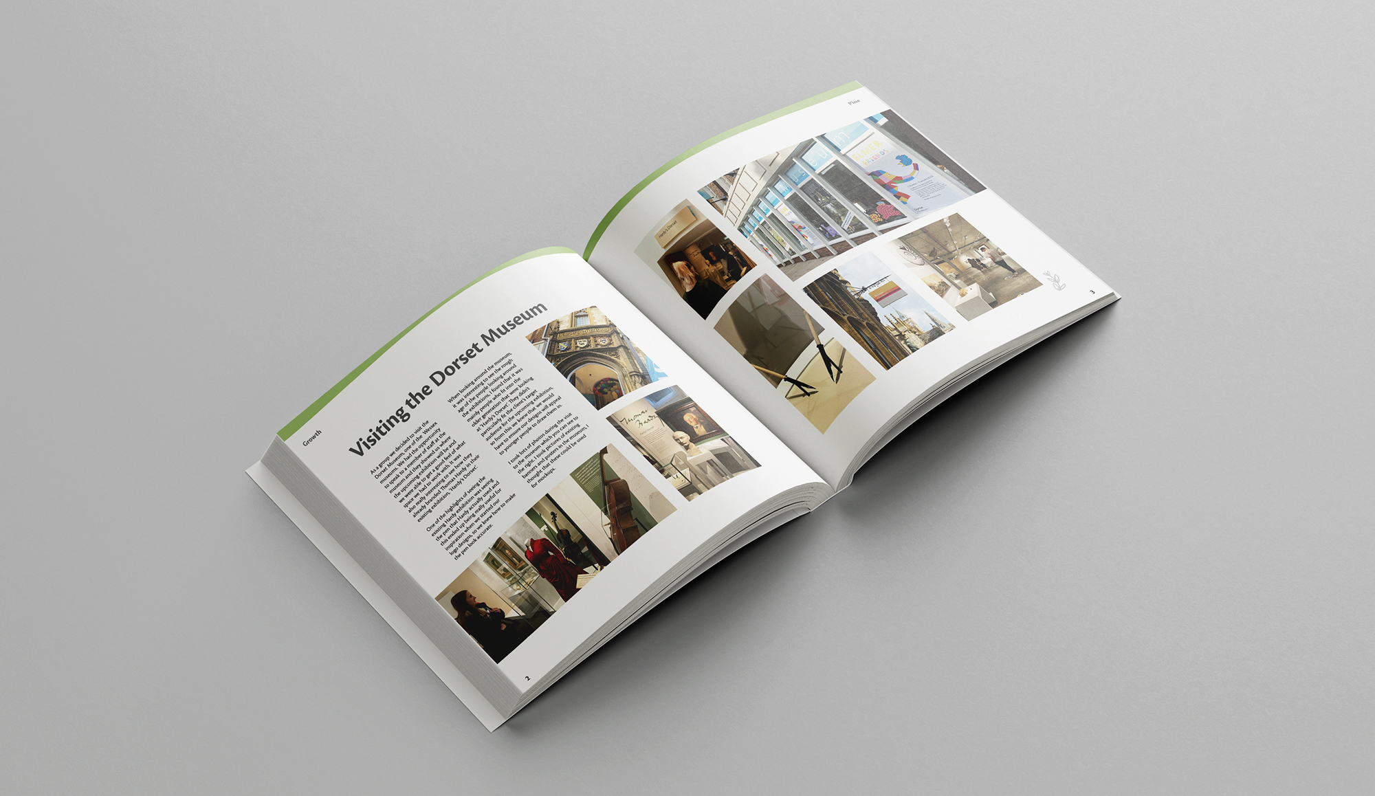
As a group we decided to visit the Dorset Museum, one of the Wessex museums. We had the opportunity to speak to a member of staff at the museum and they showed us where the upcoming exhibition will be and we were able to get a good feel of what space we had to work with. It was also really interesting to see how they already branded Thomas Hardy in their existing exhibition, ‘Hardy’s Dorset’.
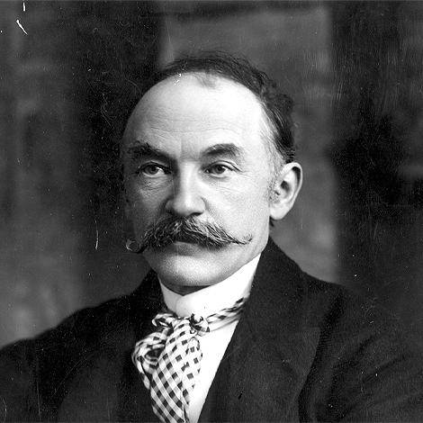
One of the highlights of seeing the existing Hardy exhibition was seeing the pen that Hardy actually used and this ended up being really useful for inspiration when we started our logo designs, so we knew how to make the pen look accurate.
The Brand Purpose
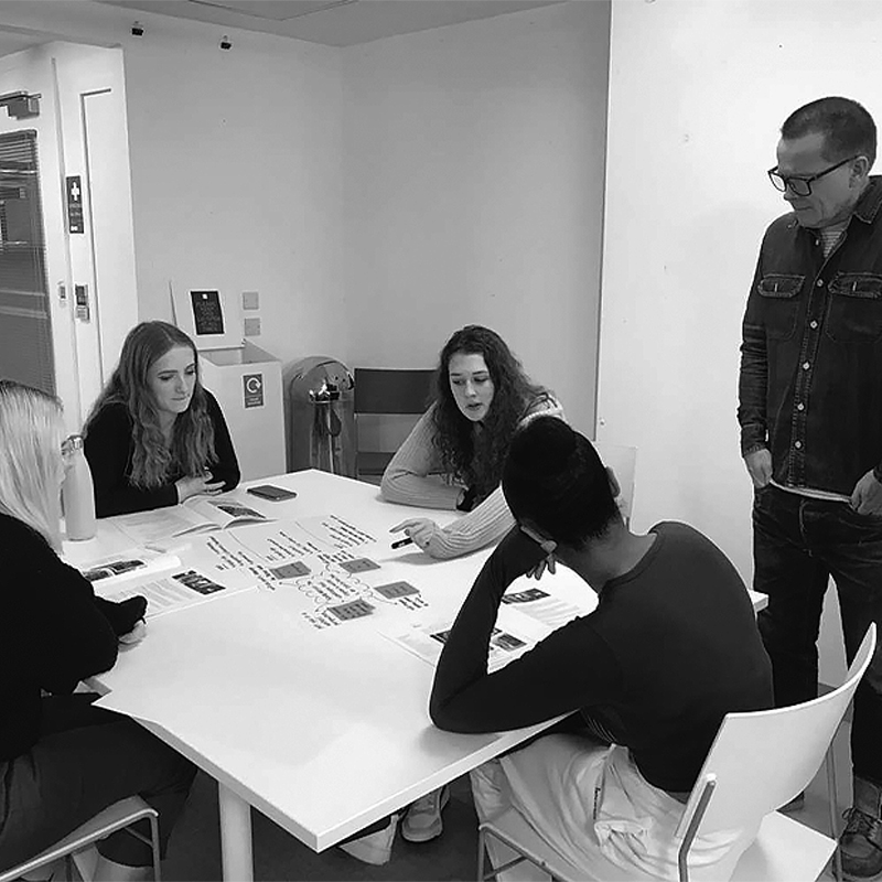
At the very beginning of the project, the first step was to work out what our brand truth for the exhibition would be. We had a workshop with award winning art director- Ben Friend. He taught us that a brand purpose is about connecting with consumers on a more emotional level which helps boost sales as well as loyalty. He showed us the TED talk by Simon Sinek in which spoke about the Golden Circle model and how the best brands talk about why they do what they do rather than just what they do.
As a team, we used the Golden Circle model to create our own brand purpose for the exhibition. The original name for the exhibition was “Hardy’s Wessex: The landscapes that inspired a writer”. As designers, we felt that this wasn’t intriguing enough so we created mindmaps and notes to figure out a way to create a brand purpose that was much more exciting and that better represented the exhibition to appeal to the target audience.
Our Brand Truth:
"The exhibition will inspire the writer within you."
Initial Ideas
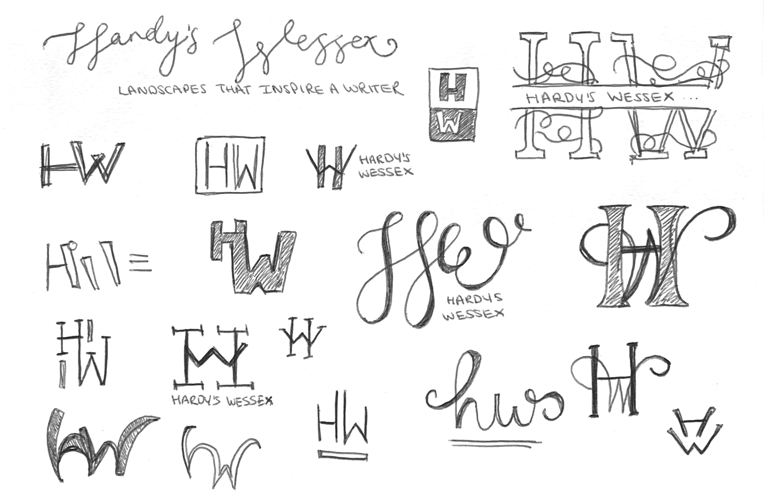
Our first step of the design process was to generate as many different logos as we could with the focus of Hardy as the writer and the Dorset landscapes that inspired him. I started off the logo design process by doing a wide range of sketches, some of which you can see to the right. I then took what I thought were my strongest sketches and developed them digitally.
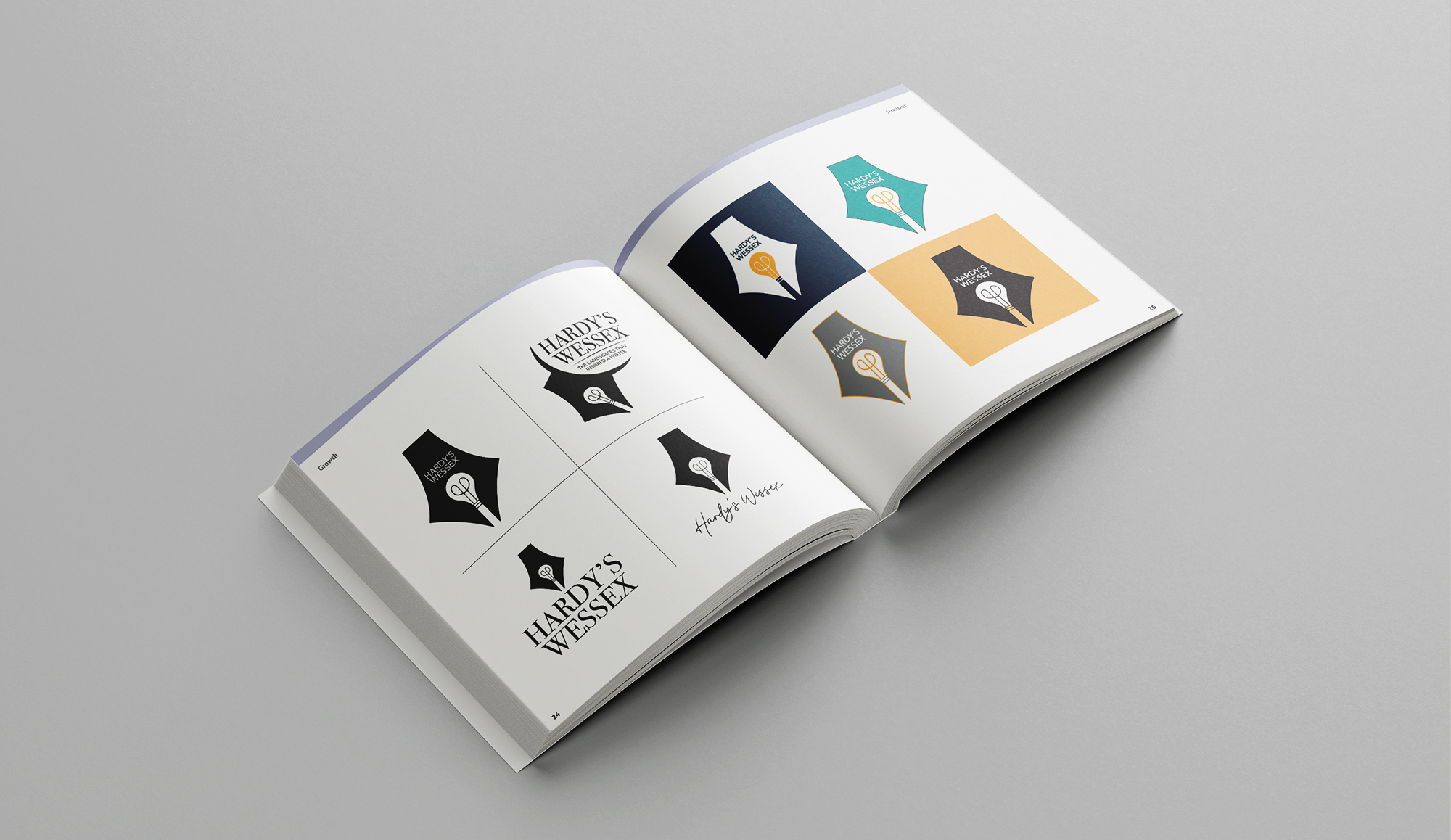
Below you can see some of our initial logos from each member of the team. After a lot of discussion and conversations with the clients, we ended up choosing my pen logo on the right hand side to take forward and develop into our final logo.
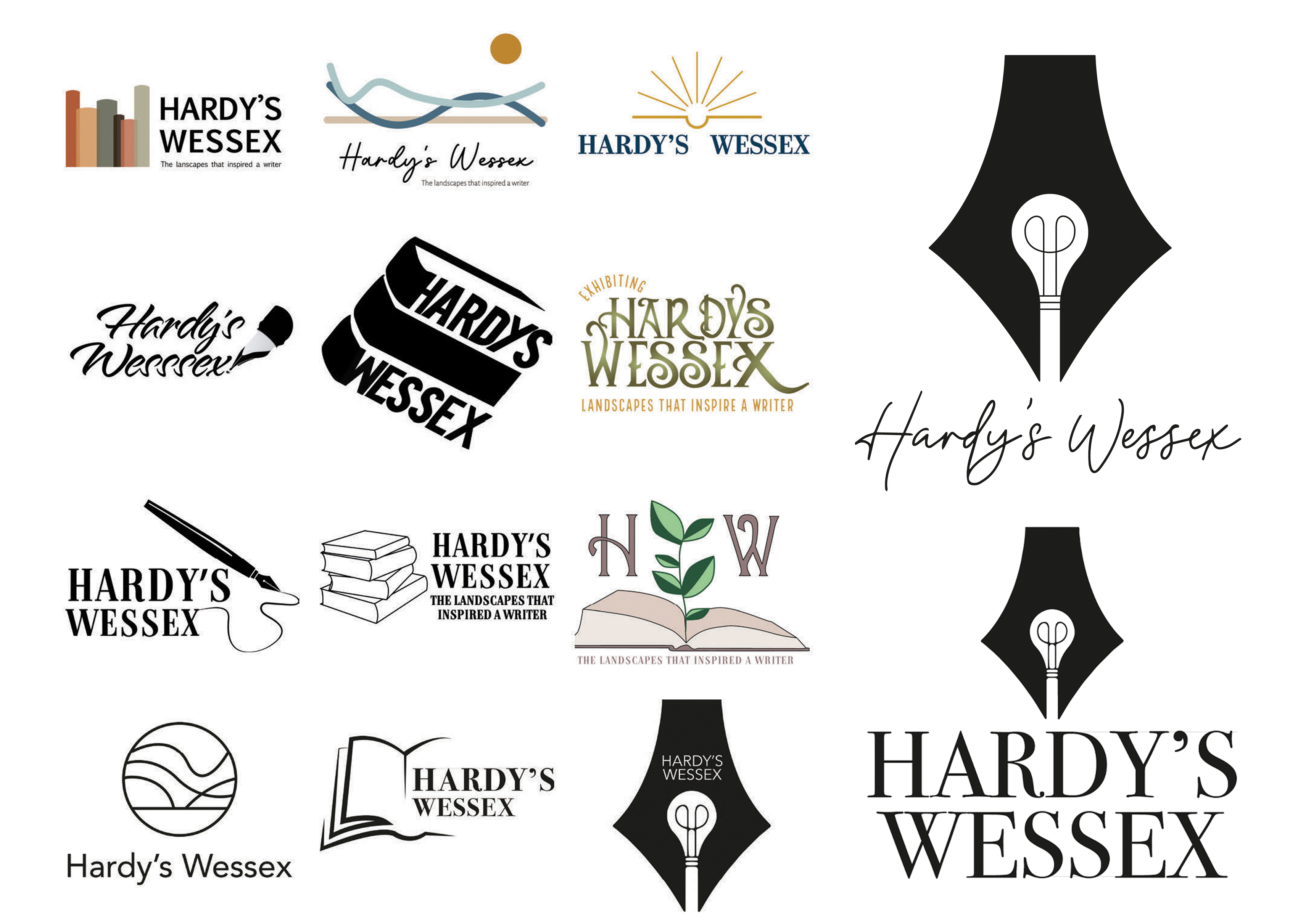
Our final logo
Here is our final logo along with the Wessex Museums logo, which we made sure to compliment with our use of black and white. The pen symbol is kept from my original logo design with the light bulb symbolising inspiration and the illustrated leaves symbolising the landscapes that inspired him to write.
Colour Palette
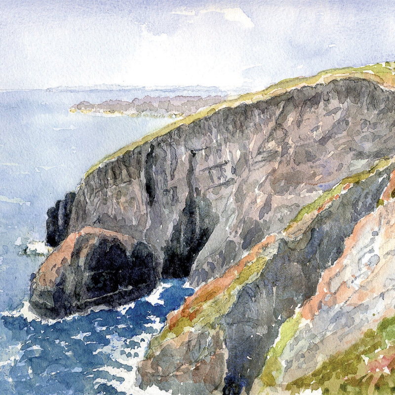

Our colour palette features colours that we picked out of a painting that was provided to us by Wessex Museums. We liked the subtle links to landscapes. These colours feel very welcoming with a mix of bright and dark colours that compliment each other really well. We also felt that these colours would appeal to anyone from any generation who might be visiting the museum.
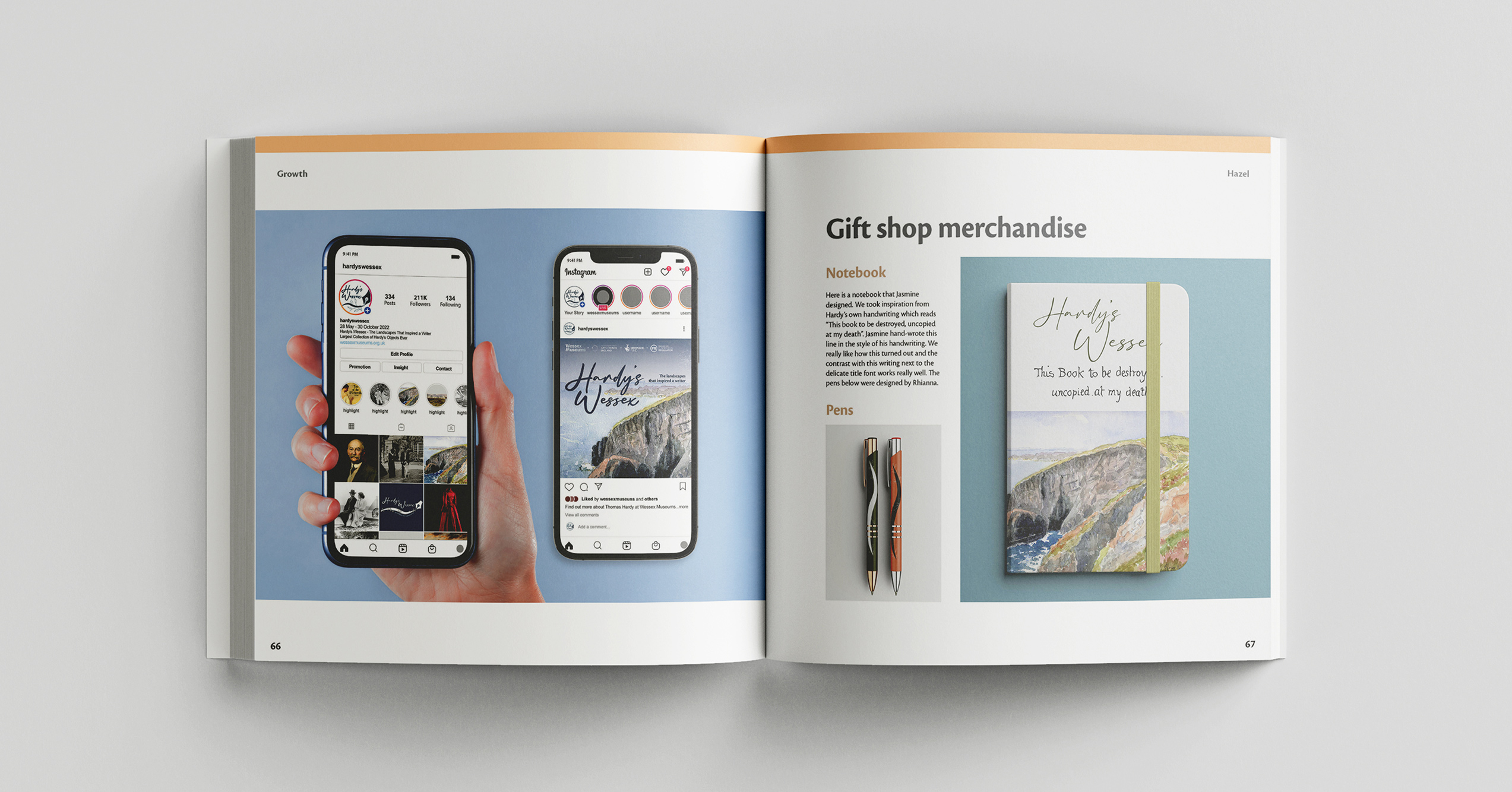
Our final outcomes
After a lot of experimenting with different design styles and routes and after also receiving some useful feedback from our class critiques, we came up with the following final outcomes for the exhibition which we feel really sums up Hardy well and would encourage visitors from all generations to visit. All assets of the exhibition feature photos that were provided to us by Wessex Museums.
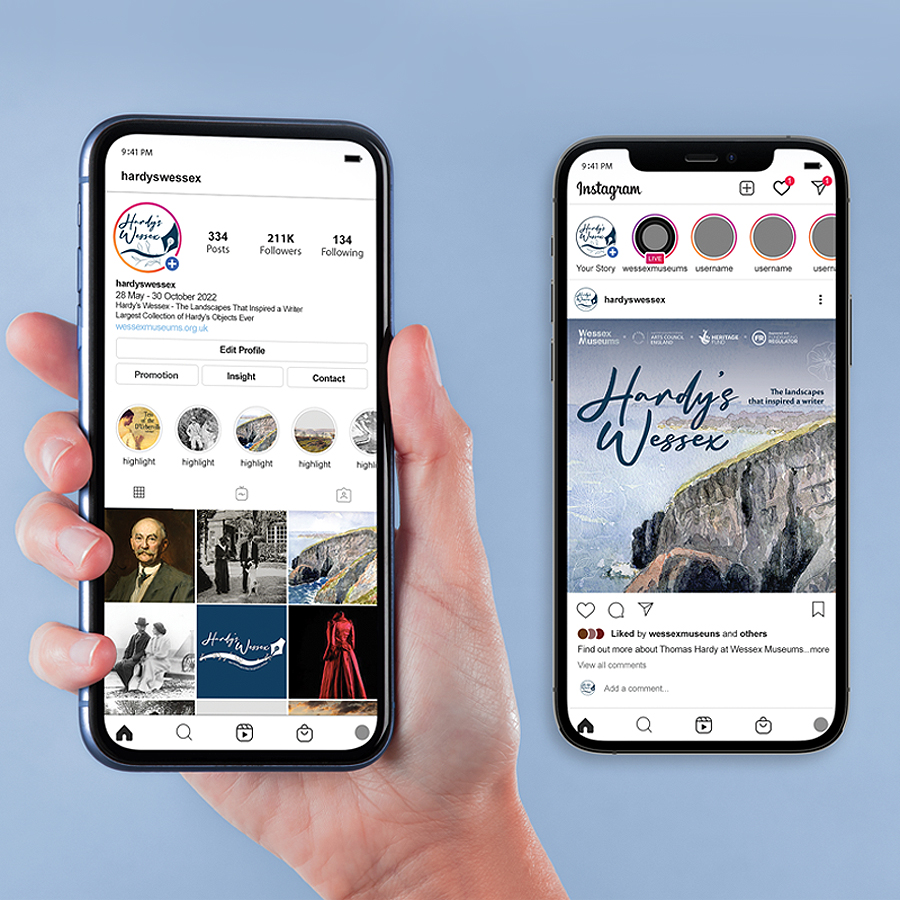 Hardy's Wessex Instagram mock-up.
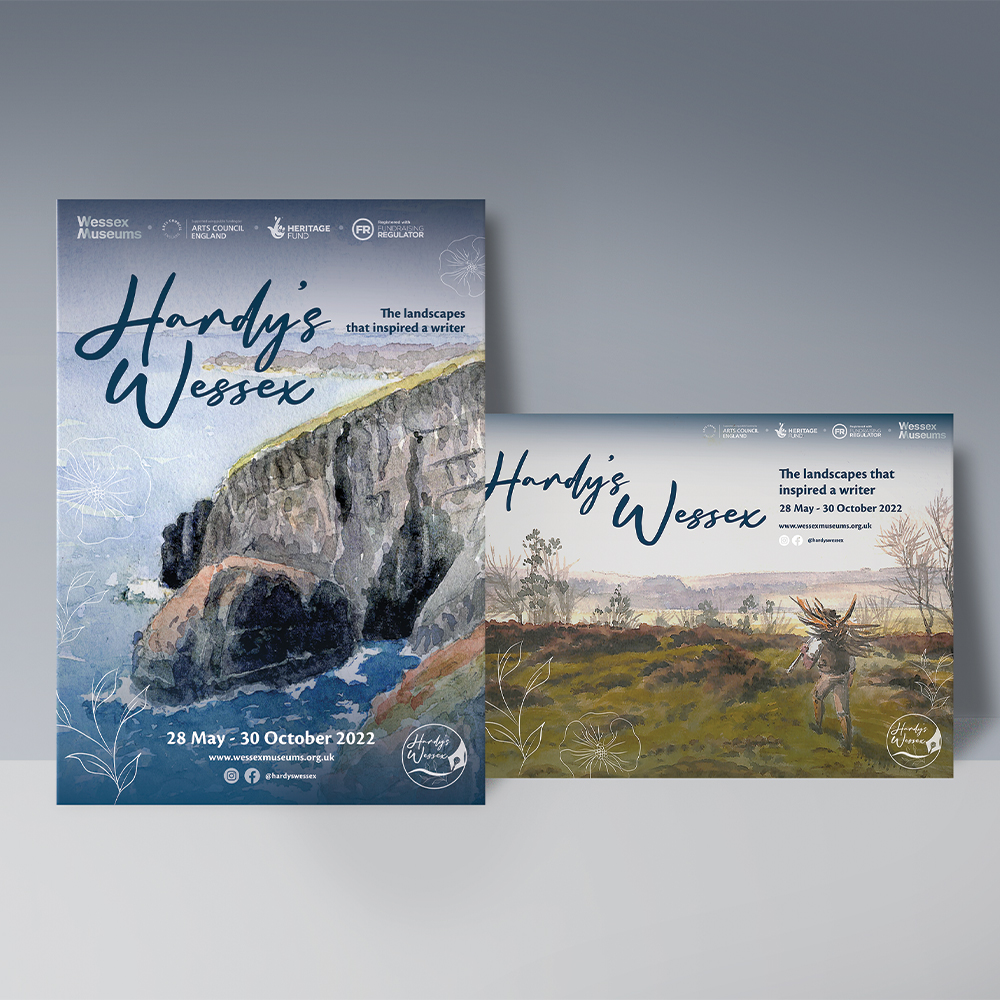 Poster designs.
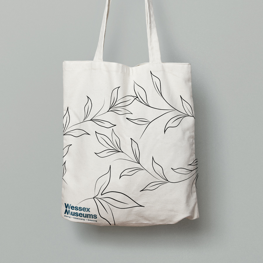 Tote bag to be sold in the museum gift shop.
 Notebook to be sold in the museum gift shop.
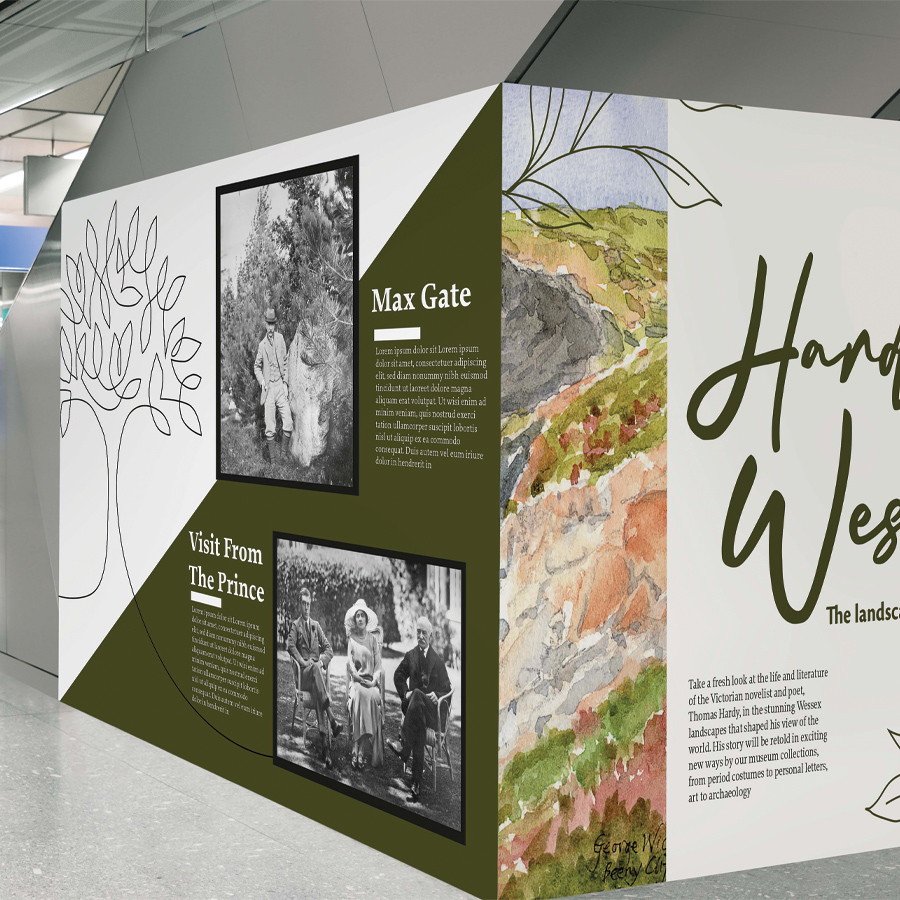 A mock-up of one of the walls that would be in the exhibition.
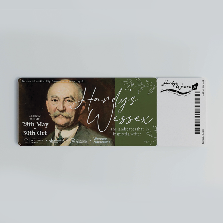 Entry ticket for the exhibition.
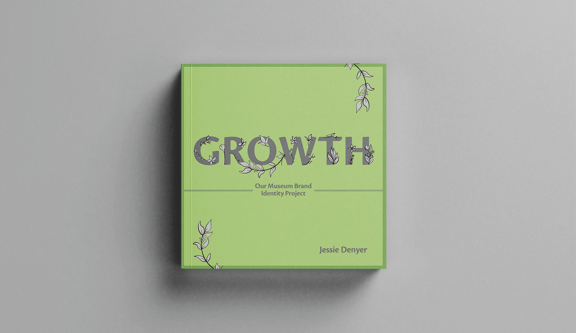
The Process Book
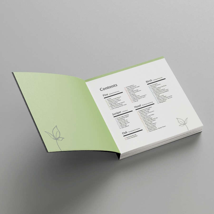
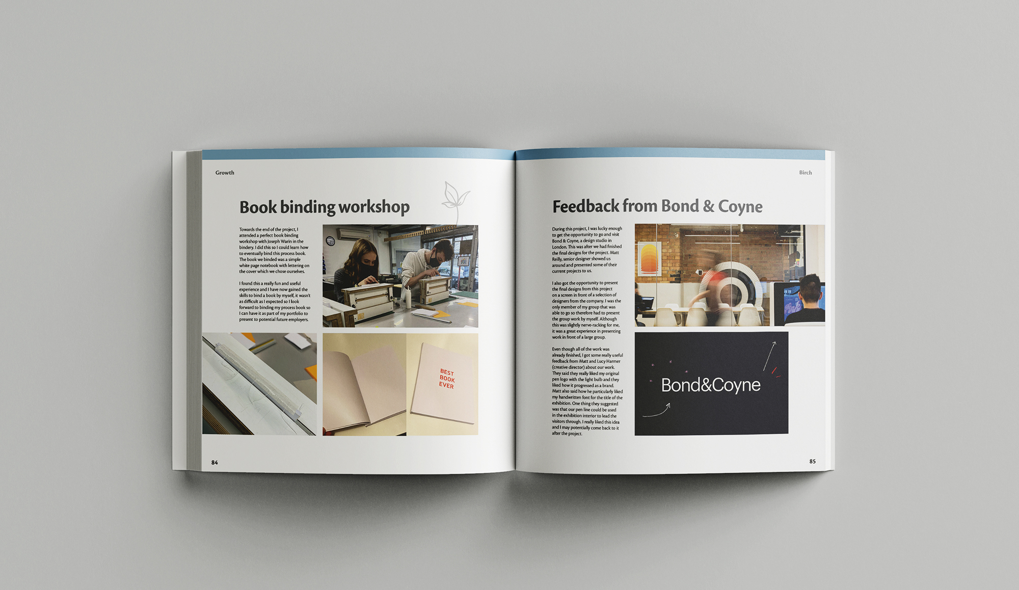
As part of this project, we had to produce a process book at the end to show the development of the whole project, from the research, the testing and then the producing of the final outcomes. I enjoyed designing the page layouts for the book and the outcome looks very professional and I aim to get this printed and binded eventually.
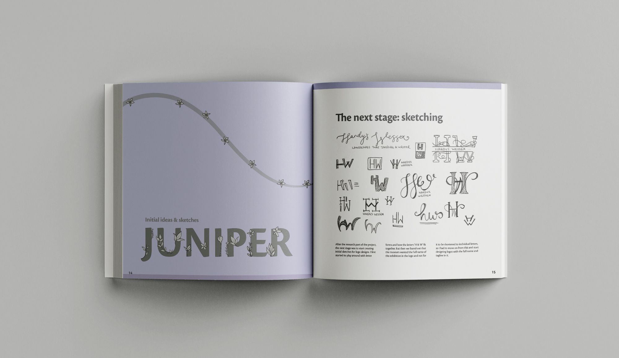
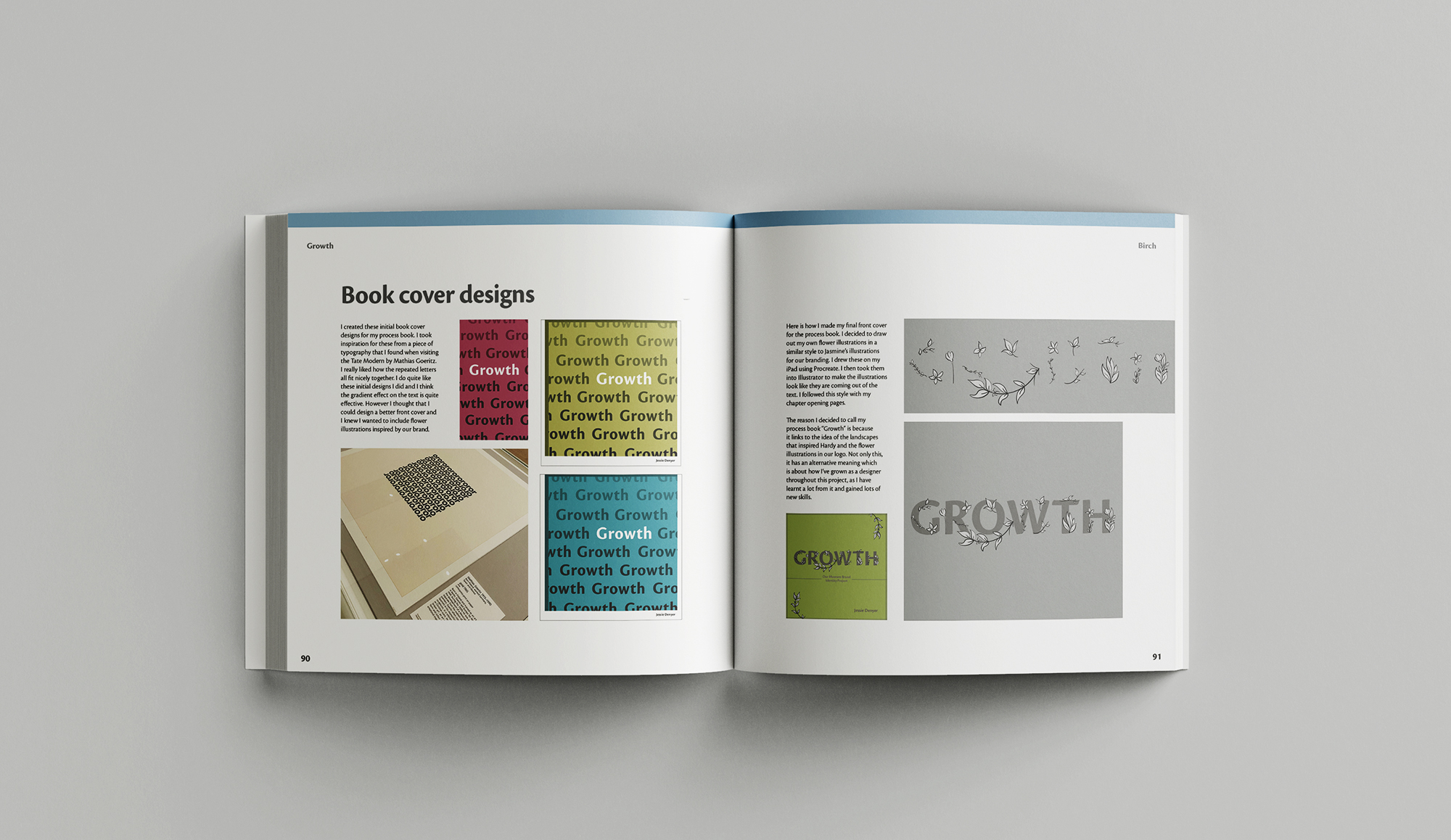
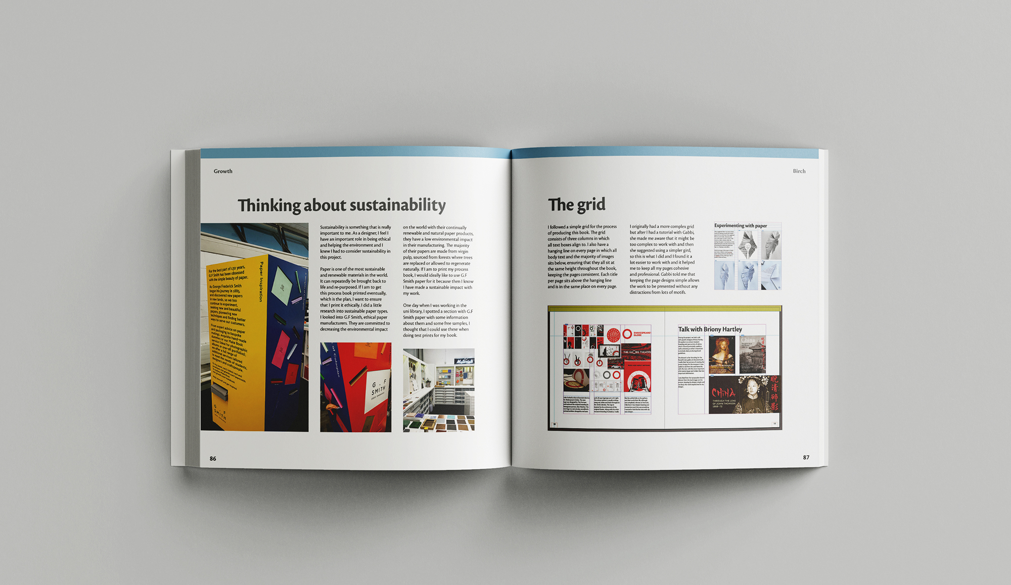
Layout and editorial design is one of my strong points within graphic design and I find it particularly enjoyable. This was one of my favourite projects to complete so please feel free to have a flick through some of my spreads from each chapter in the slideshow below.
Reflection
I really enjoyed this project and I am very happy with how it all turned out. We created a brand identity that is visually strong and compelling. Our brand identity is modern and fresh, appealing to the appropriate target audience of 18-35 year olds, but isn’t too modern that it wouldn’t appeal to older generations, those who typically adore Hardy’s work.
I have learnt a lot during this project. I have been advancing my digital skills and ability to use Adobe software through the many useful workshops we had. I have also improved my presentation skills throughout this project through the mix of online and in-person presentations.
Overall, I am proud of our work on this project. I enjoyed having the opportunity to work collaboratively and I felt that this went really well. I am happy with my commitment to the group and the design work I put forward towards the final identity. I have learnt a lot throughout which I will take with me into future projects.