The Making Of The Website
The Brief
The brief for this project was to design and build our own portfolio websites to present our graphic design work in a professional manner, showing off our work for potential future employers to see. We had to use HTML and CSS to build them which was a completely new experience for me.
Website Structure Workshop
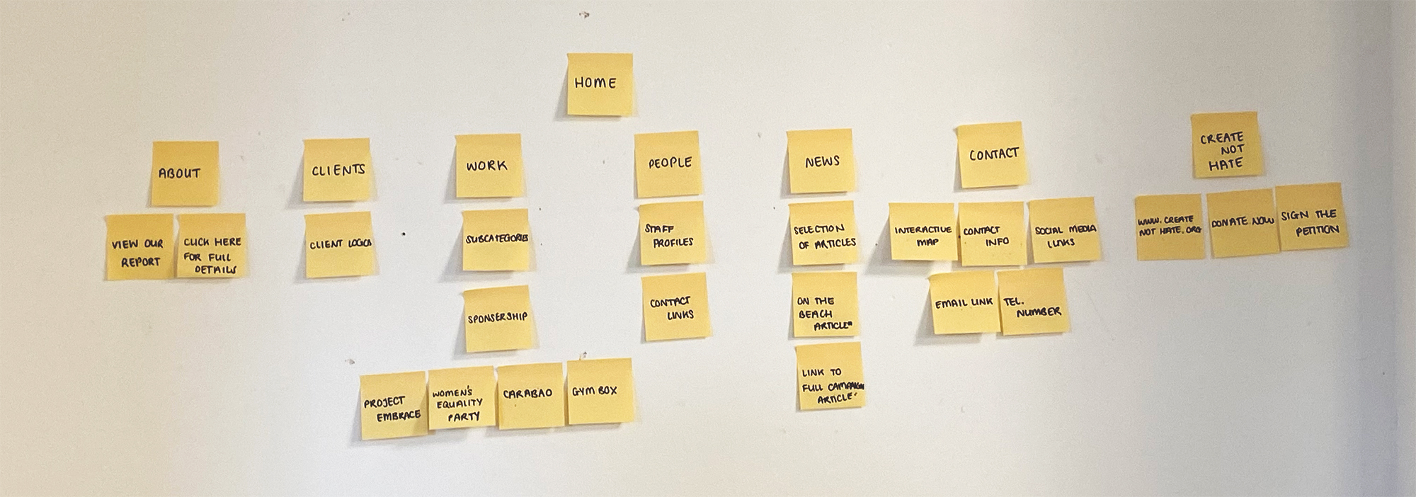
At the beginning of the project, we had a workshop with Mark on website layout and structure. In small groups we had the task of navigating and analysing existing websites for design agencies to see what makes them successful. We broke down the structure of the websites and laid out the basic layout with post-it notes on the wall in the studio.
I found this a particularly useful task because it helped me to get an idea of how most successful websites are navigated and this inspired me when thinking about my own website layout.
Thinking About Content
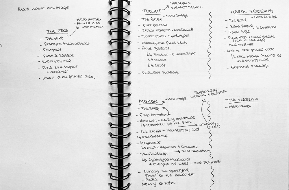
After the first workshop, I started to think about the content for my website. I had to figure out how much of each project to include to ensure that it shows enough of the process but also isn’t too long-winded that the viewer could get bored of scrolling. I made some notes of what I planned on including from each project and in what rough order they would be.
Planning
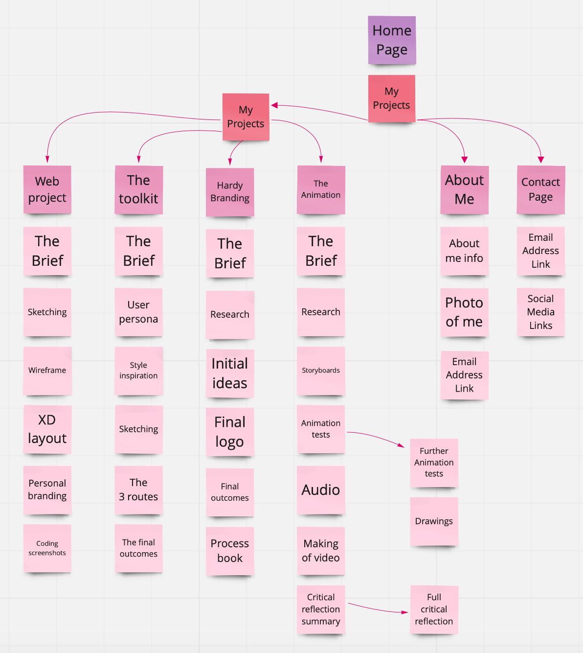
Once I had a rough idea of what to include on my website, I decided to plan out the structure for my website, to figure out how the user could navigate it. I decided to do this task based on the initial studio workshop. I knew that I wanted the structure to be fairly simple so it wouldn’t get too confusing and the main focus could be on my design work. I wanted my website to keep the user engaged the whole time, making them feel welcomed to scroll through my work with a conversational feel to the whole website.
Wireframe Layout
Another workshop we had was the wireframe workshop. We were given the template for a basic website so we could begin to see how our websites could actually work. My wireframe was quite simple with only four projects, all connecting to the index page, I decided that I wanted my main projects menu to be on the home page of my website, so they are always easily accessible. Thinking about this made me excited to get designing my actual website.
Developing a Personal Brand
Before building the website, I knew that I wanted to build my personal brand so that my website has a professional look yet also represents me as a person and my style. I didn’t already have a personal brand before doing this project, so I thought that it would be fun to build one for my website.
Style Research
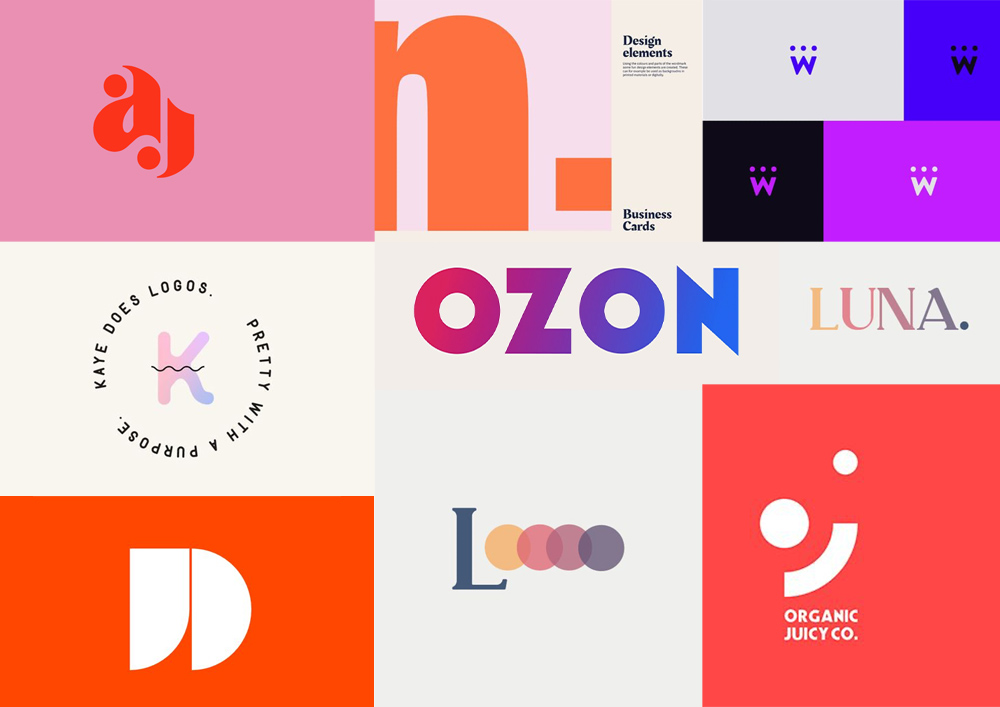
Before deciding on an overall design style for my website, I did some research into design styles that interested me. I looked at styles which incorporated some of my favourite colours and I found some cool and modern logo designs that I wanted to take inspiration from for my own logo designs.
Developing My Personal Brand
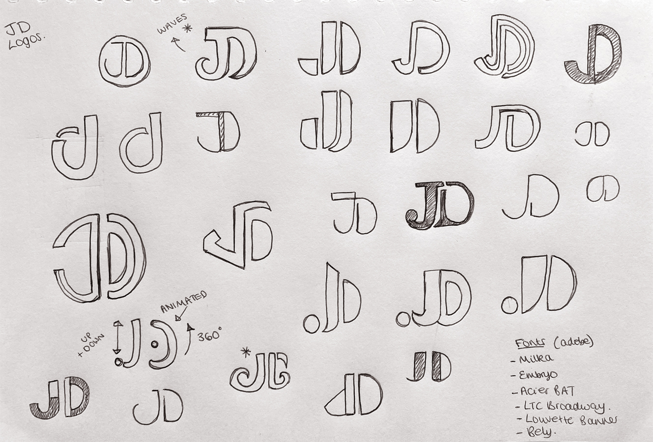
I hadn’t designed a personal logo before, so I was excited to begin this process for the project. I thought by having my own logo, it would really bring the whole website together. I started off by doing some sketches of my initials in a variety of ways, inspired by my style research and some existing ‘JD’ monograms that I had seen before.
Designing Logos On Illustrator
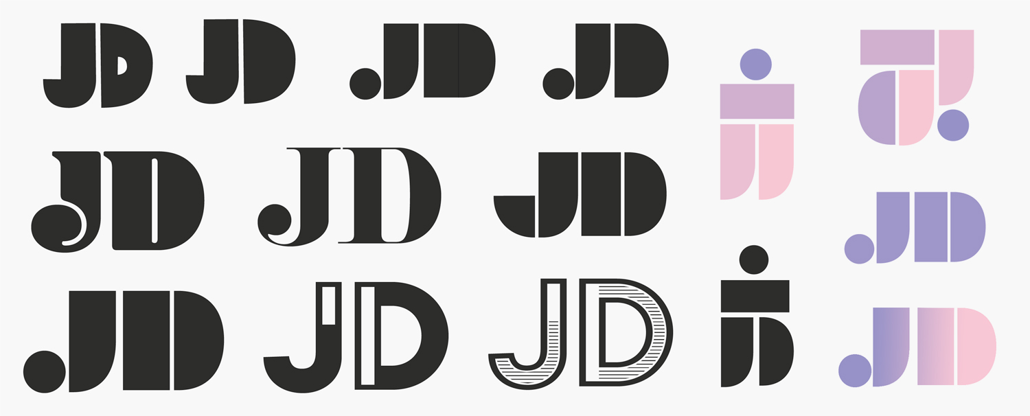
Based on some of my sketches, I started producing some logos in Illustrator. I started off by experimenting with different fonts, seeing what the letters looked like next to each other. Some logos appeared more playful than others and although I quite liked this feel, I felt that it almost looked too childish. I particularly liked the fonts that were broken down into different shapes, I thought this could have a lot of potential for a brand identity so I decided to play with this idea further, having different shapes to form the letters ‘JD’.
Developing The Logo
For the final logo, I picked out a font that I felt represented me and my style as a designer. It appears cool yet classy. For the colours, I was experimenting with different choices and then I created this purple/pink gradient, I think these colours represent me as a person as they are two of my favourite colours.
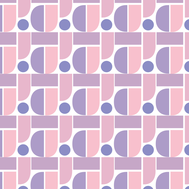
I also designed a branding pattern inspired by my logo. I created this by taking the individual shapes from the letters that make up the logo and arranging them to make a pattern. I like how the pattern is geometric and modern. I designed it with the intention of using it on areas of my website, however, I felt that it would look too busy amongst images of my work so I decided not to use it in the end.
Creating An Animated Logo
After making my logo, I knew that I wanted to design an animated version to be included on my website. I thought this could be fun to do, to also advance my skills in After Effects. I played around with moving the individual shapes around, so it looks like the letters come apart and then come back together to form my initials. After doing that, I experimented with making it colour changing. I created another gradient to do so. I’m really happy with how the little GIF works.
Using Adobe XD
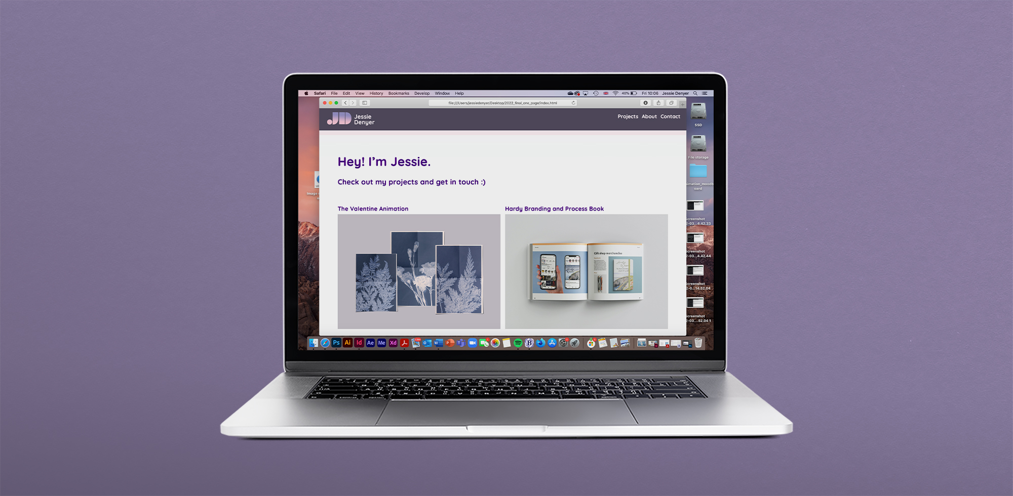
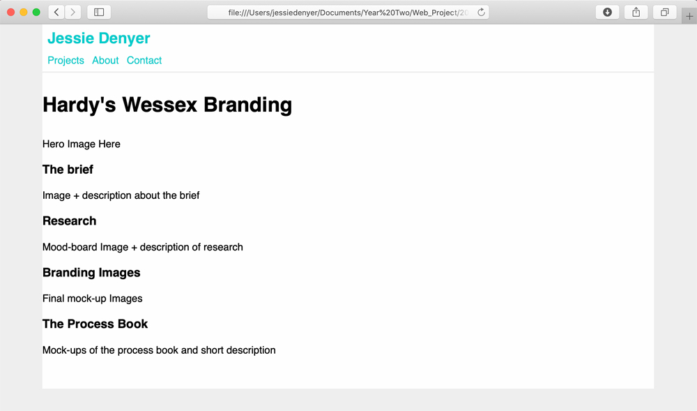
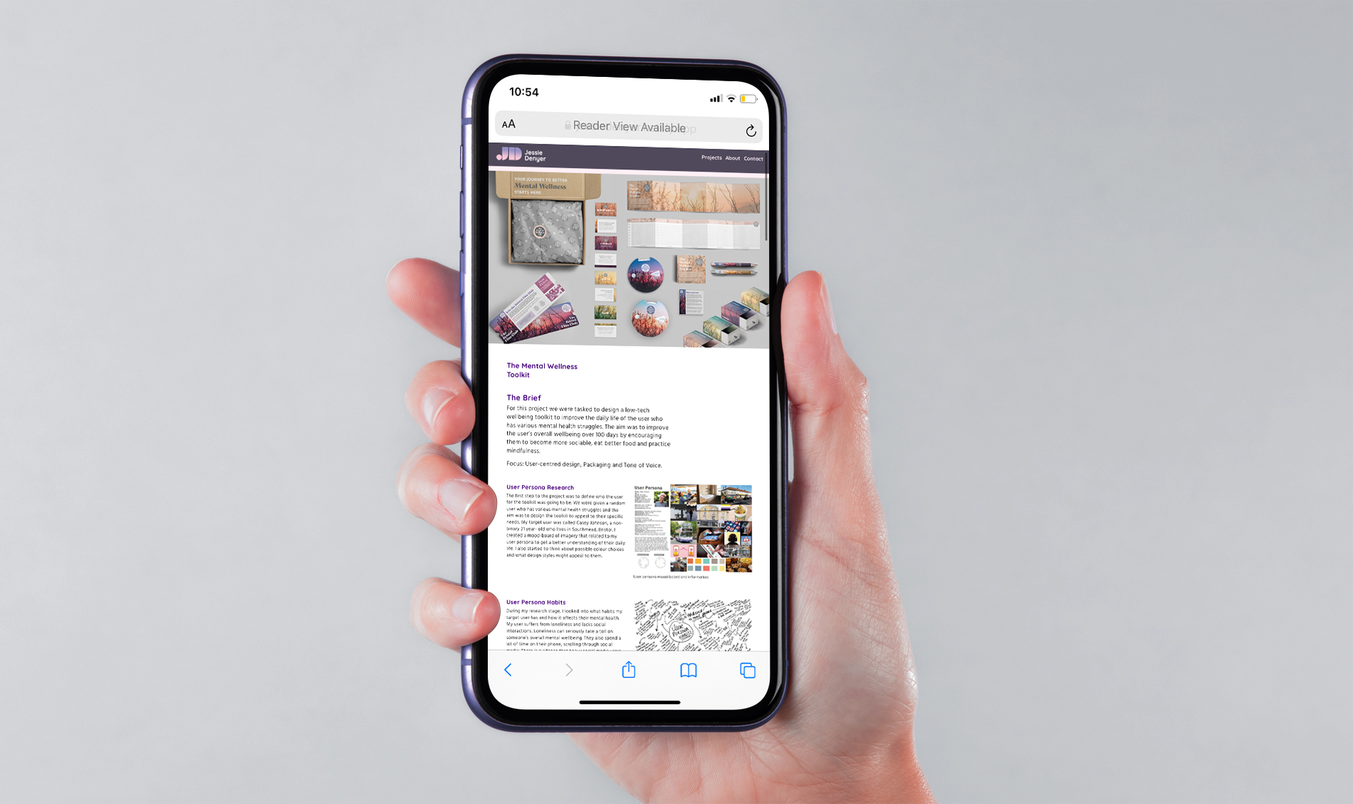
Once I had planned out what content I was going to put on the website, I used Adobe XD to plan out the layout, starting to think about the design of each page. I hadn’t used Adobe XD before this project but I found it incredibly useful to plan out the layout in full detail to see how it would look visually.
I knew that I wouldn’t be able to design the actual website on XD but I used my layout on there as a guide when building the actual website and it helped me to ensure that I hadn’t forgotten any important parts of each project. When producing the layout on there, I wasn’t sure how well I’d be able to produce it with HTML and CSS, as I wasn’t sure how hard it would be. But luckily I feel that I managed to get the hang of the coding and I followed my initial design on XD pretty well with the final website, obviously making a few changes as I went along with building it.
Typography And Colour
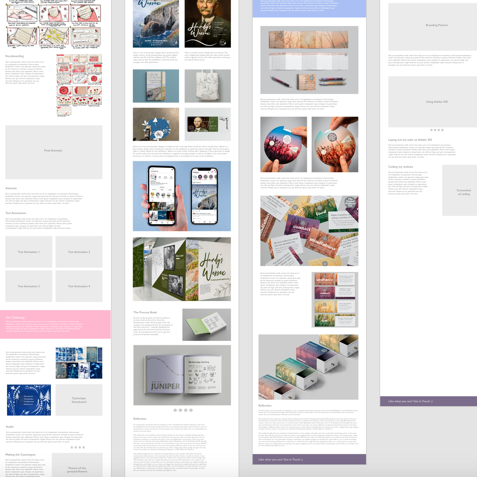
When choosing the colour palette, I wanted to pick colours that best represented me and my personality, so the best way to do this was to use my favourite colours- pinks and purples. I knew that I wanted the background to always be white to keep it looking clean and professional so that all the images stood out against it.
For the font choices, I used two different fonts. I used ‘Quicksand’ for all the headers and titles. I like the playful appearance of this font but also how it still looks professional and consistent on each page. I didn’t think that ‘Quicksand’ worked too well for the body text, so I found another font; ‘Hind’. This font compliments the headers really well. It’s not too heavy for the body and I think it looks really neat.
Coding
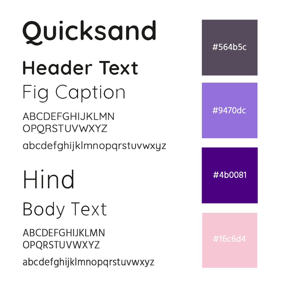
At the beginning of the project, I was expecting the coding aspect to be quite a challenge for me. However, I decided straight away that I was going to put a lot of effort into learning HTML and CSS as I wanted to create a website to be proud of. I read up on a lot of websites and undertook some of the ‘Free Code Camp’ tutorials which I found really helpful. I also attended all of the coding workshops which were crucial for learning all the basics of CSS grid.
I used Mark’s template as the basis for my website and from there I edited it a lot, adding in all my content and structuring it to make it my own, learning lots about coding as I went. I used BBEdit to organise all of my code. I was constantly previewing my website on the internet to check it was all working how I wanted it to. I ended up surprising myself with coding and found myself rather enjoying it. Although there were challenges at times, I found it very rewarding when it all started coming together.
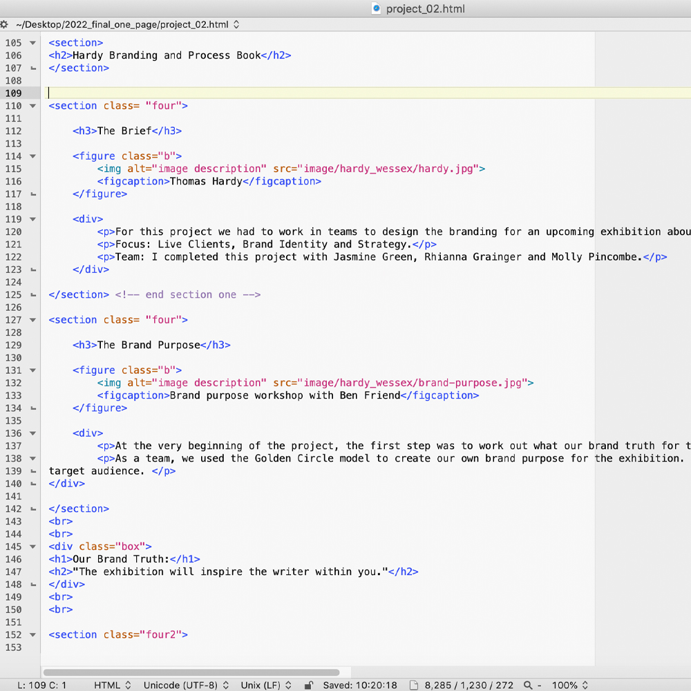
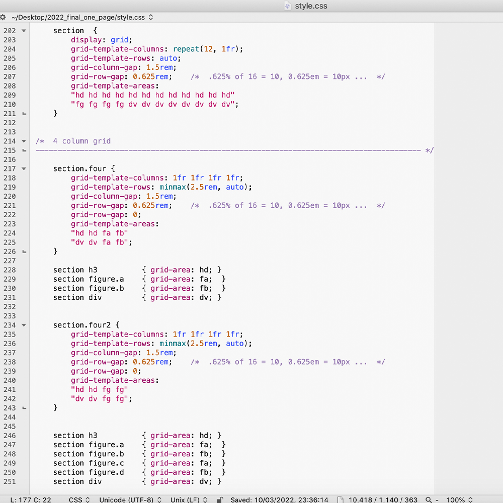
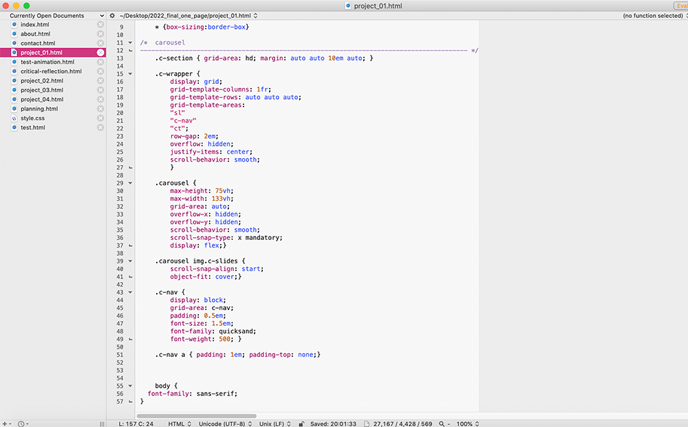
To the right are some screenshots of my coding. An example of some of the HTML I used and also an extract of my CSS style sheet.
Grids
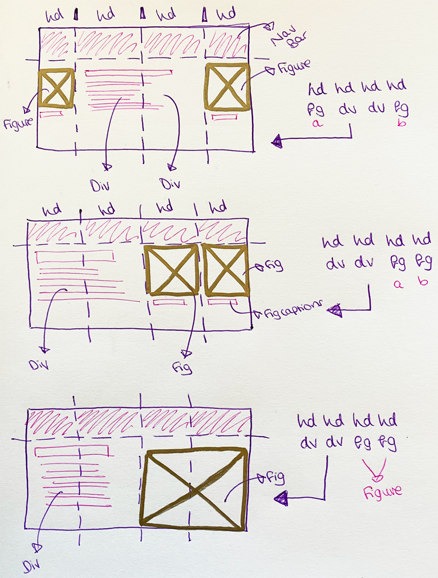
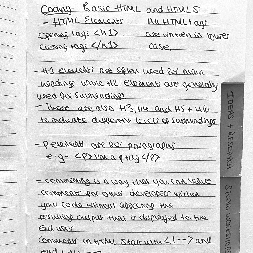
I used basic CSS grids for my website. I mainly used a four-column grid throughout which I took from one of the CSS workshops at uni. I found this grid particularly useful and I ended up using it repeatedly throughout my website. I decided that I wanted to have all my images from each project on the right-hand side of every page. I personally felt that it looked much more professional this way rather than having images on alternating on either side. I used a class ‘right’ in order to keep all the images on the same side.
Once I had figured out the four-column grid, I used the same grid but instead of having two separate images, I combined it to have one large image so I could use it to show off my designs. I used this grid with the other one to create a balance between small and large images. I like how all of my images line up in these grids.
Amongst my grids, I also have some larger images in the centre of some pages. I did this by using the ‘center’ class in my style sheet. I am happy with the variety of image sizes and placements on my website, I think it will keep it engaging for the user.
I also taught myself how to use rows and columns in CSS. 'W3 Schools' was my best friend during the project! I used rows and columns in areas where I wanted to show more images and limited writing. For example I had three or four images in a line in some places.
Checking my Website
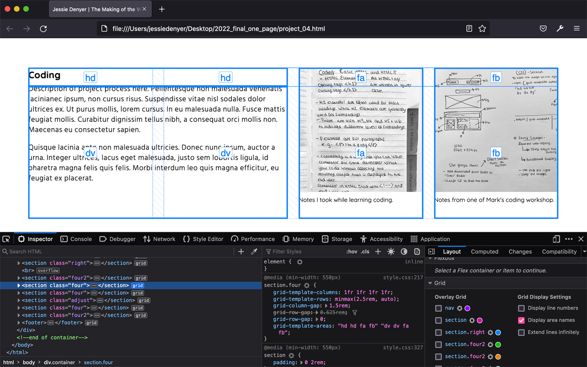
I used web inspector on safari a lot throughout this project to check where errors in my code were and this helped me to resolve them pretty quickly. To the right is a screenshot of my four-column grid over my website. This was the main grid that I used for my website.
Image Carousels
I thought it could be a good idea to use a few image carousels throughout my website. I thought it would be useful to show multiple images in one place, so it doesn’t drag out the website longer, making it boring for the user. But I didn’t want to use them where the work was really important in case the viewer doesn’t think to click through the images so I only really used it on research images which didn’t need to be showed off as much. I like how these make the website more interactive for the user.
Animated Type
When experimenting with various styling options for my website, I had the idea of having an animated typewriter effect for the title of my motion graphics project. I had this idea because we have a type-writer style effect in our actual animation so I thought it could link really well together. I liked how the animated type looked however I decided to not go forward with using it since I felt that it wouldn’t match well with the titles of the other projects, as if I was to use the typewriter effect for them, it would seem a little random.
Image Rollovers
By looking at the hero images on the projects page, I felt it was hard to understand what the project was about or what it included, so to help the user I decided to add an image rollover which included the project title and a brief line explaining what the project is. This really improved the look and usability of the website.
I originally had a pastel pink rollover to match the border of my navigation bar which I was happy with. But after my user testing crit it was suggested that I could add even more colour gradient throughout my website to link more to my personal brand. So, I decided to add a purple to pink gradient on my rollover and it worked really well. I thought it gave my website a bit more of a ‘younger’ and ‘fresher’ look so I decided to stick with this.
Navigation
It was important to think about navigation when building my website. I had to ensure that the user always knows what part of the website they are on and how to return back to certain pages. Seeing as there aren’t loads of projects on my website, I decided to have a link at the bottom of each project page saying ‘Click here to see the next project’ to encourage the user to keep looking.
Also seeing as I had quite a lot of process and work on some pages of the website, I decided to have some links out to other pages to show more from that project. This was so that the page didn’t end up getting too long and then the user can click on the link to the other page if they are interested.
I also decided to have a footer at the bottom of every page of my website. In the footer I added my email as a link so users will always be able to find how to contact me quickly and easily instead of having to click on the contact page especially.
Throughout my website I also have areas of text which have purple boxes behind them. I did this to highlight some of the important parts of my work, making them stand out. On top of this, from a design perspective, I think they look eye catching and break up the page a bit, keeping it engaging for the user when scrolling through the page. I chose the purple colours for the boxes so that it matches my overall colour palette for the website, keeping the design consistent.
Quotes from my Peers:
"Easy to Navigate"
"The colours are cohesive"
"The personal branding is very nice"
User Testing
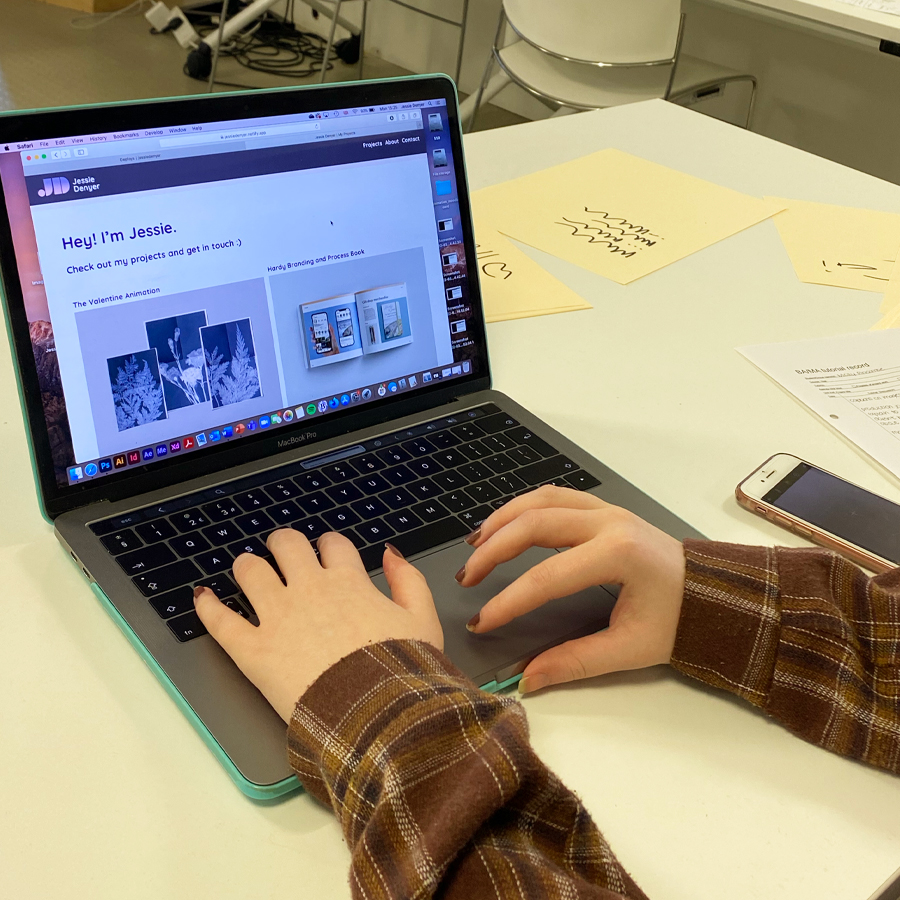
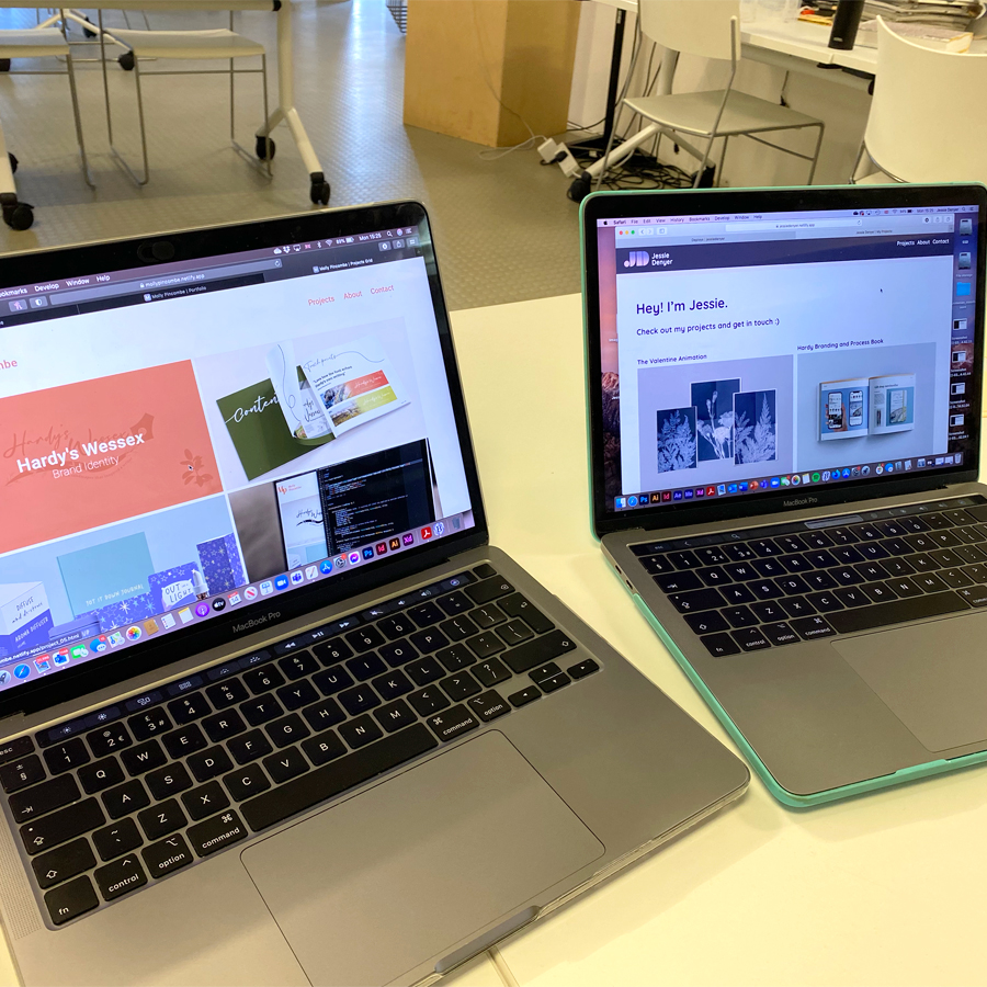
Towards the end of the project we had a user testing crit. I made my website live on Netlify and I showed it to the group and let them explore all the pages. It was useful to see how other people navigated my website, I was keen to see if they would miss any important information or hidden links but luckily they didn’t, which was a good sign that I had presented the information well. All the feedback was really good and they found it easy to navigate. I only had a few minor suggestions on how to improve the overall design which I took into consideration.
It was also important to check loading times and if everything played/worked correctly. I found this useful to check where I needed to fix a few issues, this helped me to make my website the best it could be. I also really enjoyed seeing some of my peer’s own websites as well. It was interesting to see everyone’s takes on the brief and we helped each other out with any issues we might of had with our coding.
Here is a photo of my feedback that I got during the user testing crit. There were only a few minor changes that were given to me which were thankfully pretty easy to work on and didn't take too long. I got a lot of positive verbal feedback from all my peers and tutor which made me feel happy with where my website was heading.
Testing my Website on a Phone
Even though it wasn't required in the brief, towards the end of the project I was curious to see how my website worked on a phone. I knew that it wasn’t going to work on all devices perfectly seeing as I had only focussed on designing it for a laptop/computer screen as that was my main priority for the four weeks. However, when I searched my website on my phone, I surprised myself. It worked pretty well, and there were only a few minor issues that needed fixing. I haven’t been able to fix all of these issues in time for the deadline as I wanted to make sure everything was how I wanted it to be on a laptop and computer screen. However, I intend to keep progressing and improving my website and hopefully I’ll eventually have a website that will work perfectly on all devices.
Overall, I am really happy with my website. From having no idea about anything coding related to having a fully functioning website which showcases my design work in only four weeks, I am very proud of what I have achieved. I aim to keep further improving and updating my website in future in the hope of showing my future employers.
Critical Reflection
Before beginning this project, I had little to no knowledge on HTML and CSS so when reading through the brief for this project I was a little shocked and nervous about how I was going to create an actual website, all in four weeks. But I’m very happy to say that I have surprised myself and I have created a website that I am proud of and that meets the learning objectives that were set. And on top of this, I have discovered a new interest for coding.
Click here to read my full critical reflection for this project.