Mental Health Awareness
The Brief
The brief for this project was to choose a mental health charity and design a campaign poster, billboard and leaflet for them. I chose the charity Mind, as I felt that what they do is really important. I started off by doing some research into the campaigns they have got already, and then came up with some of my own ideas.
Experimentation With Acetate
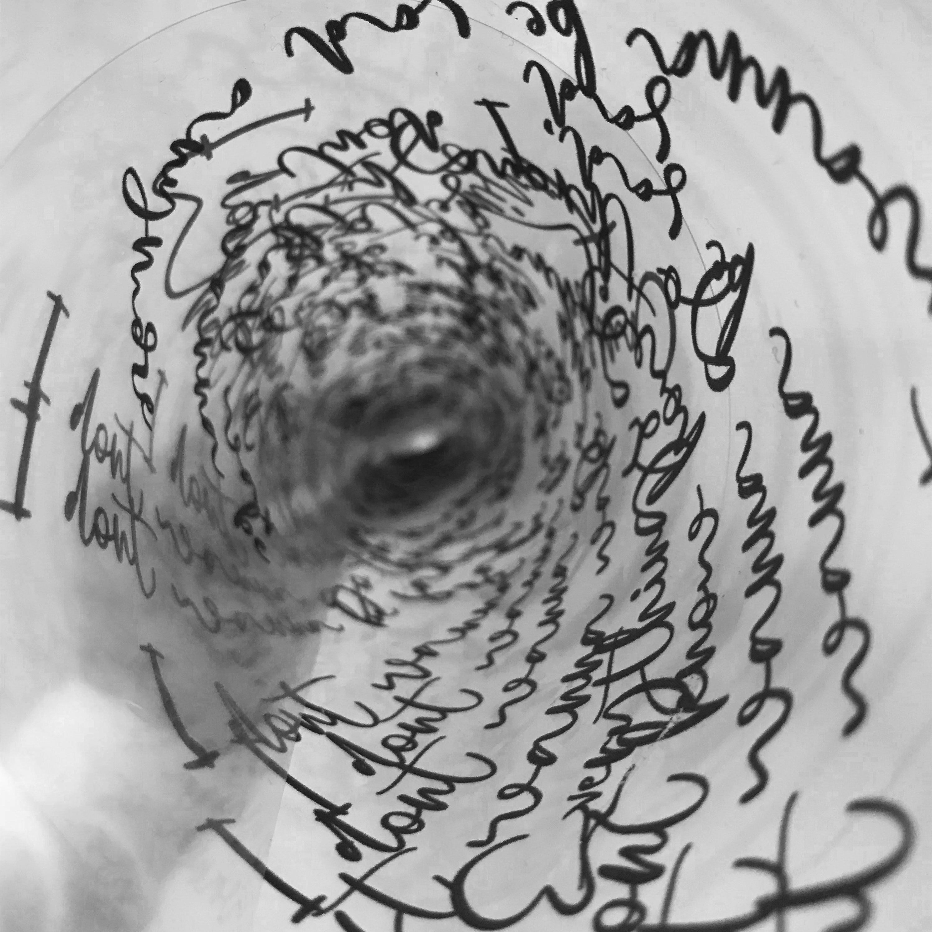
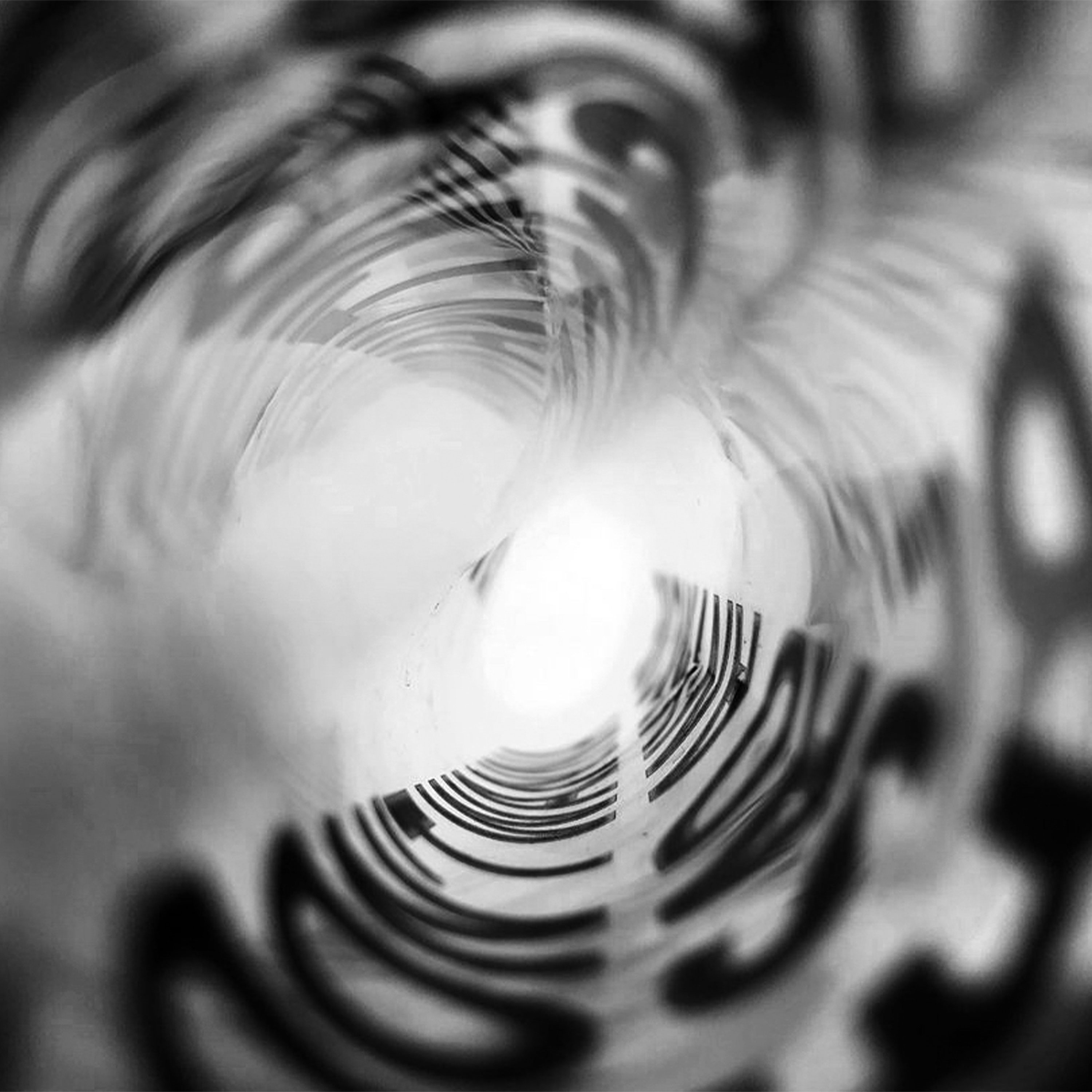
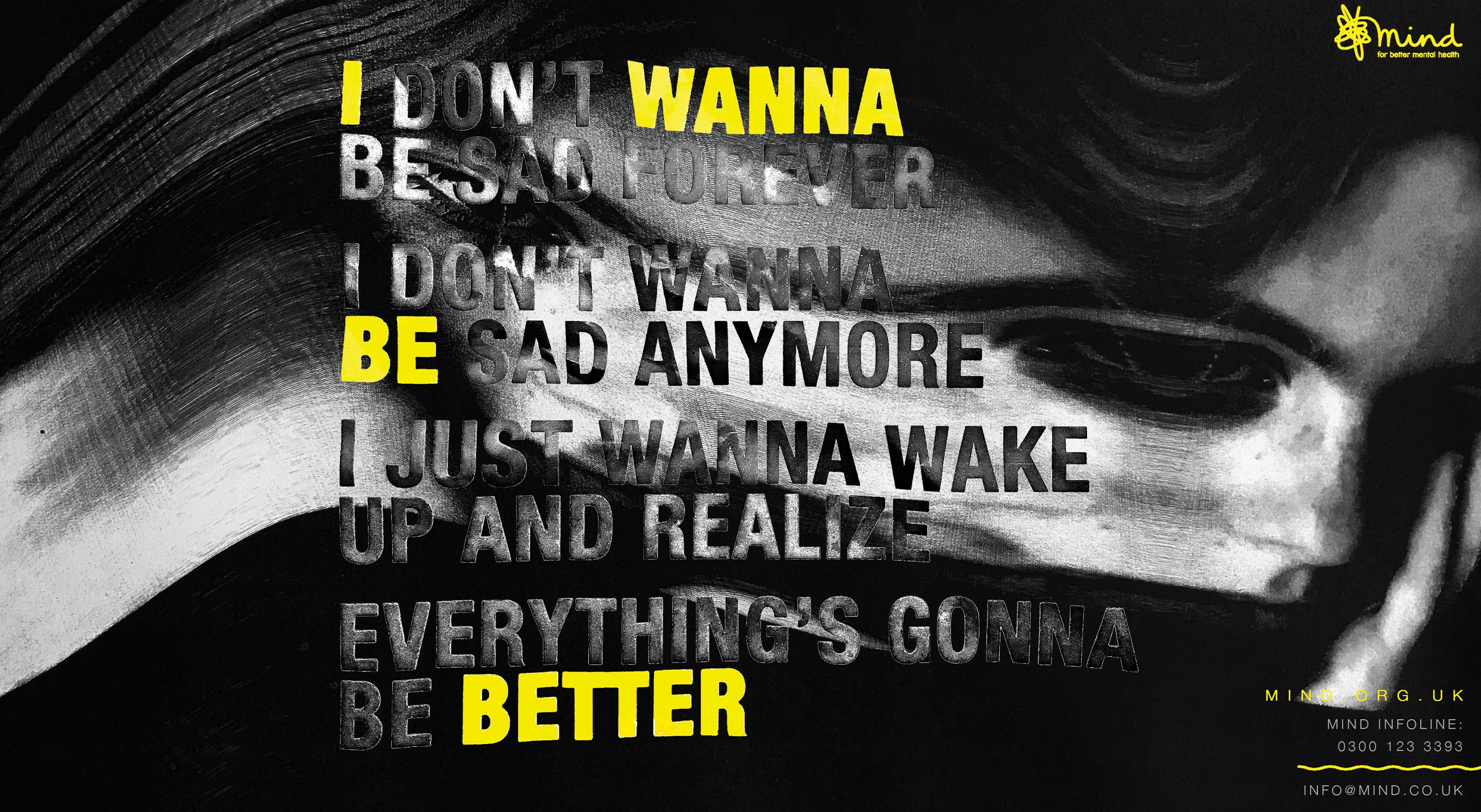
I decided to experiment with printing some typography onto acetate as this was something that I had never tried before. I printed off some text inspired by lyrics from the song- 'I don't want to be sad anymore' by Lauv. Once I had printed them, I took photos of the acetate in different ways, such as in a circle or scrunched up. I liked how the words overlapped each other, becoming hard to read. I thought this typography symbolised all the 'hectic' and 'troubling' thoughts inside the mind of someone with mental health.
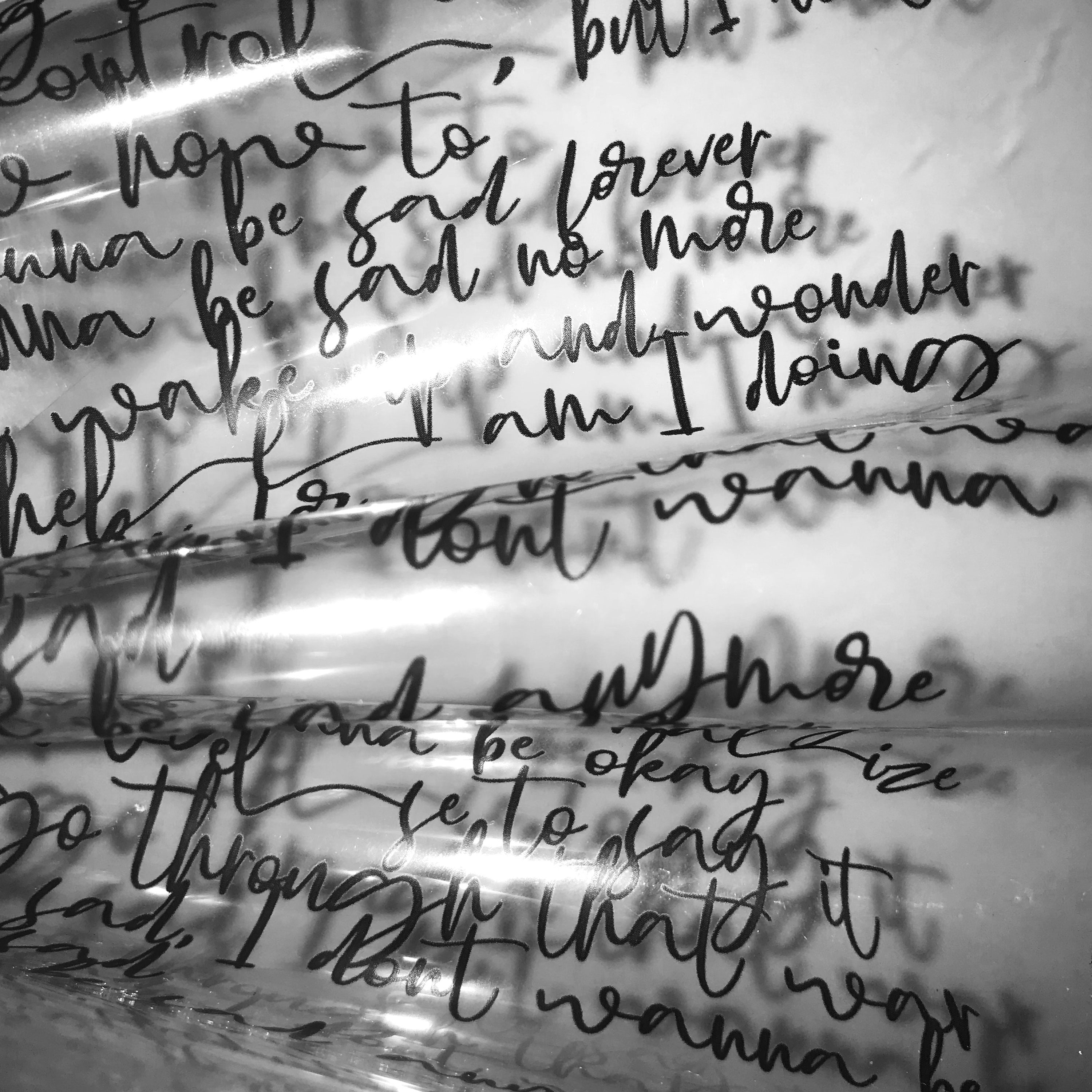
Poster Designs
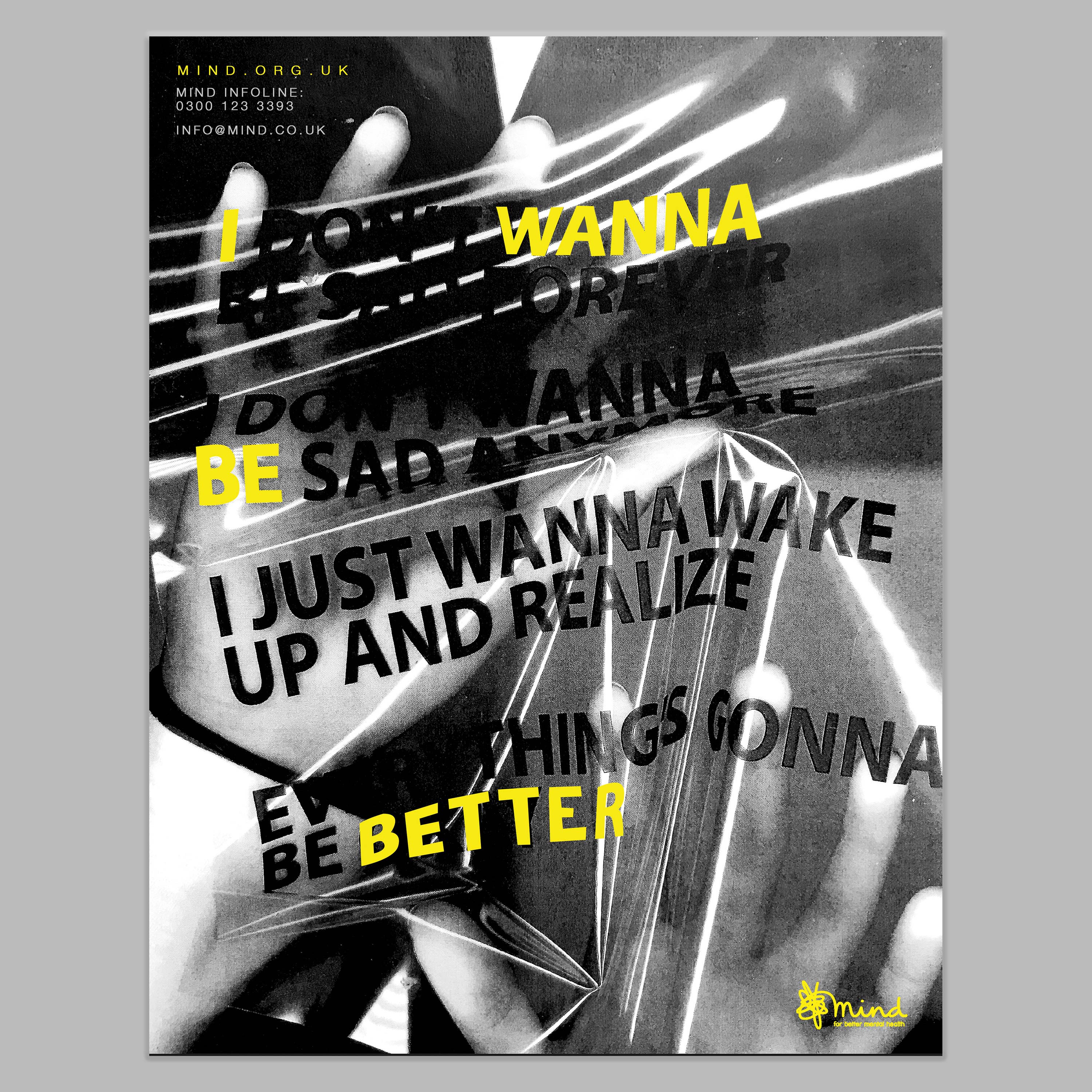
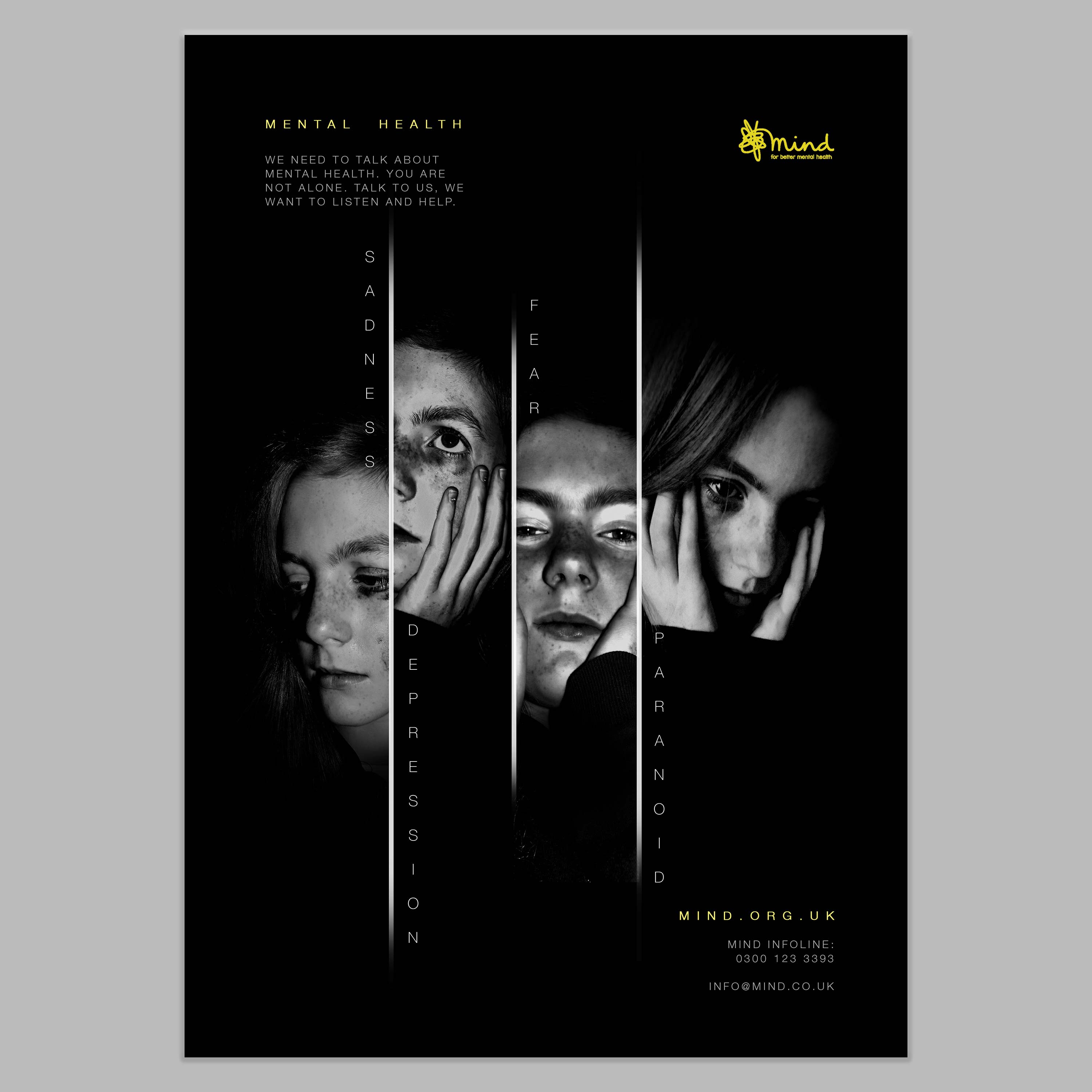
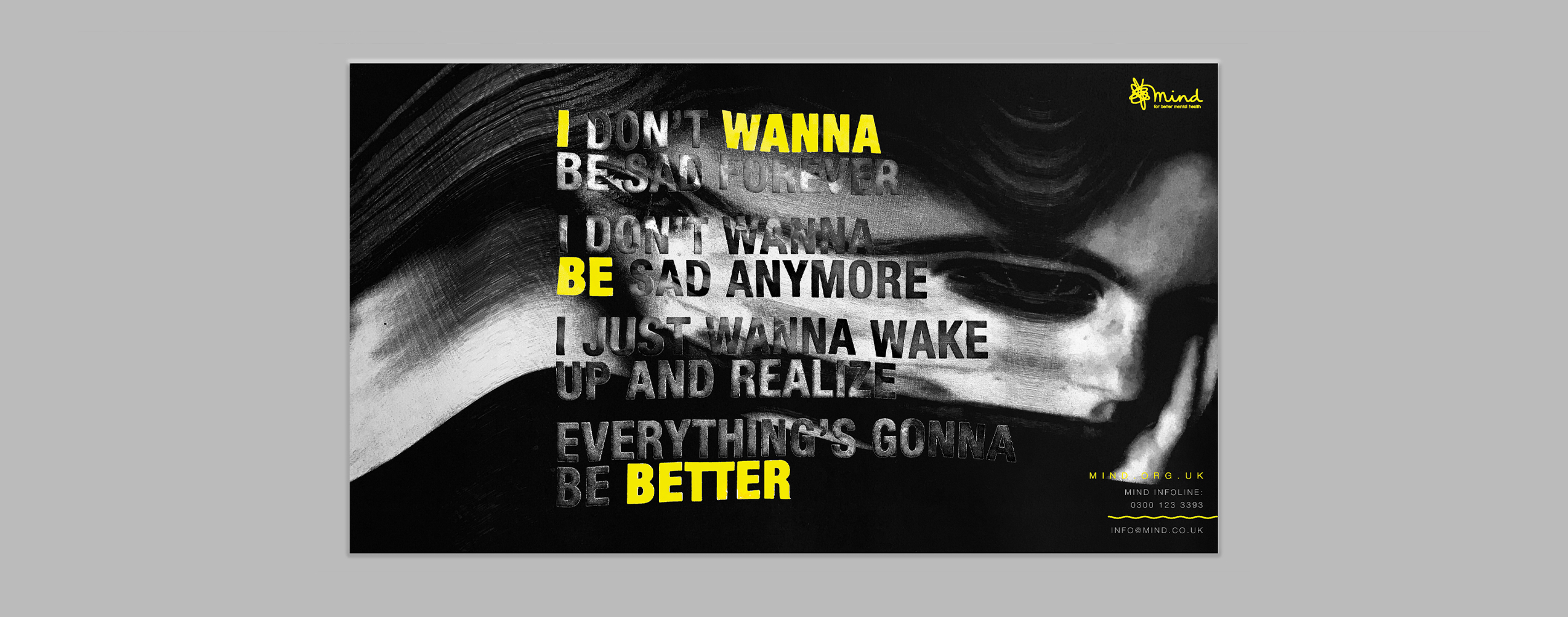
For the project, I created two different poster designs. For one I experimented with placing acetate onto a photo copier and then placing my hands over the top while scanning- this was to represent how someone struggling with mental health might feel trapped inside their own mind. For the other poster, I took my own photos of a model and used these to show the different types of mental health with a more simplistic poster design.
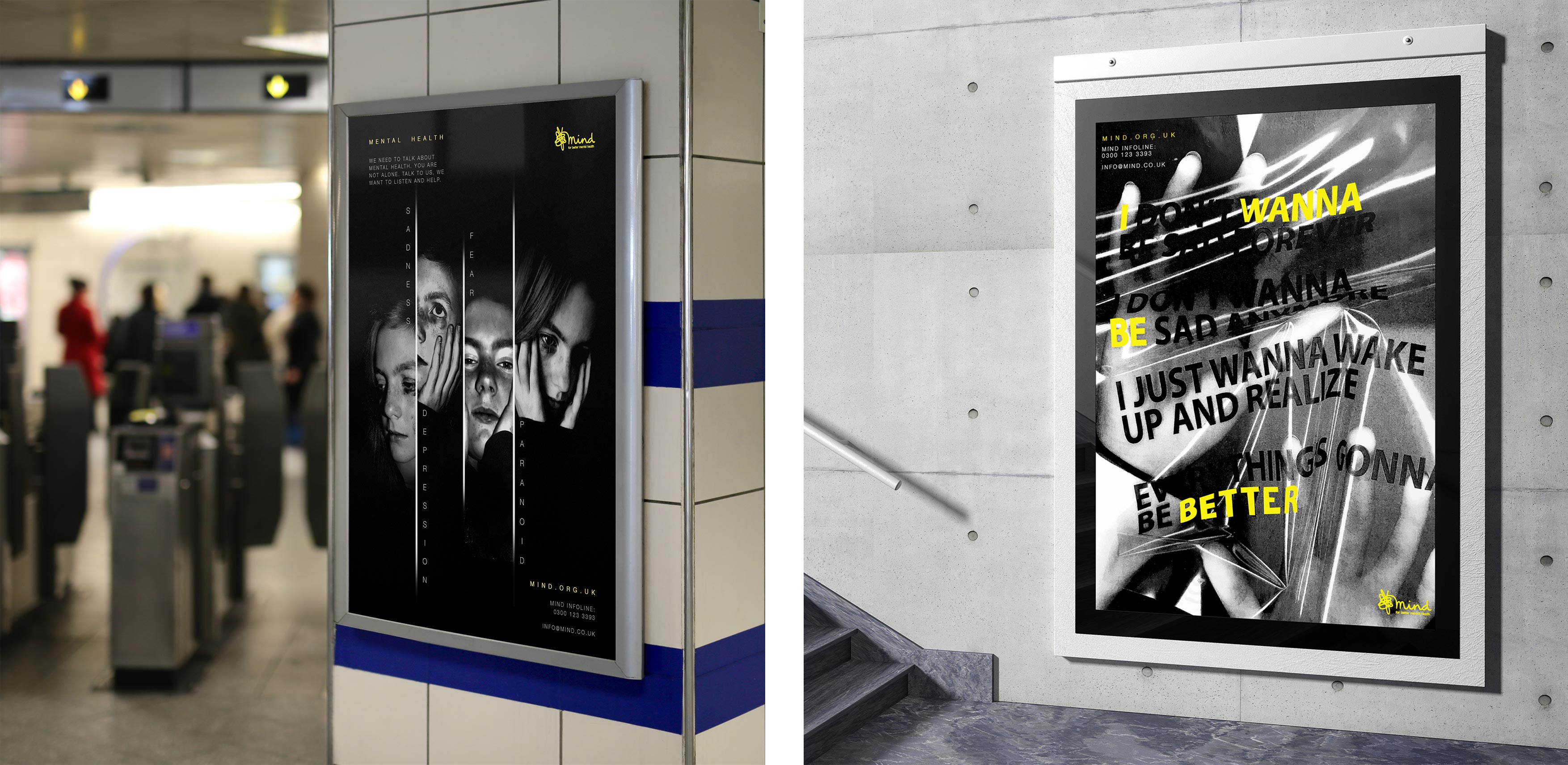
Billboard Design
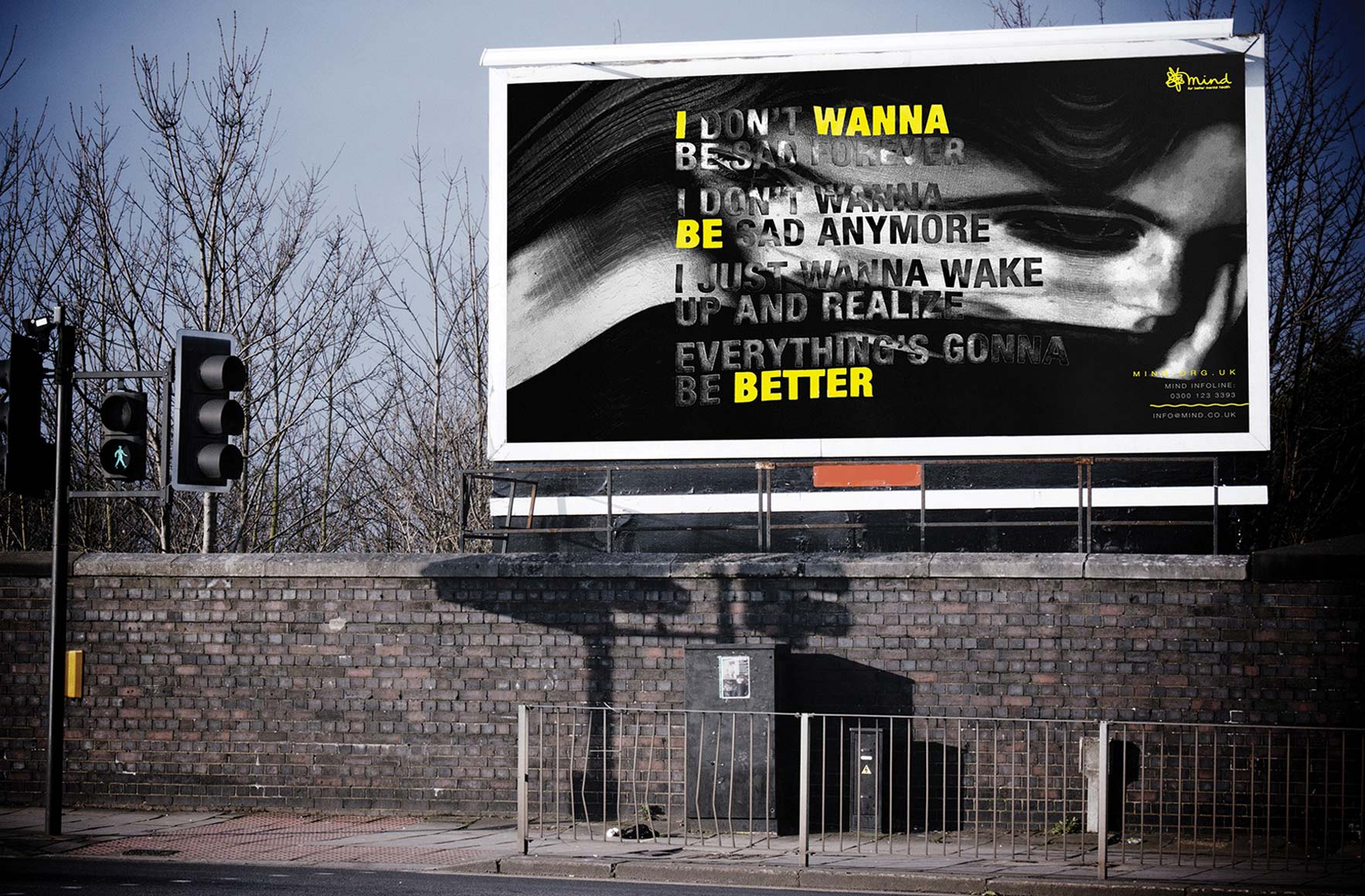
I also did a billboard design to go with my campaign. For this I used my own photography and then stretched it with the photo copier to represent someone feeling stressed, with their mind being 'pulled'. I used the same typography as I did for my acetate experiments. The yellow text highlights a positive message within a sad one. The dark imagery is to empathise with how the viewer might be feeling, but the yellow provides positivity and represents the light in the dark tunnel.
Small Contact Information Leaflet
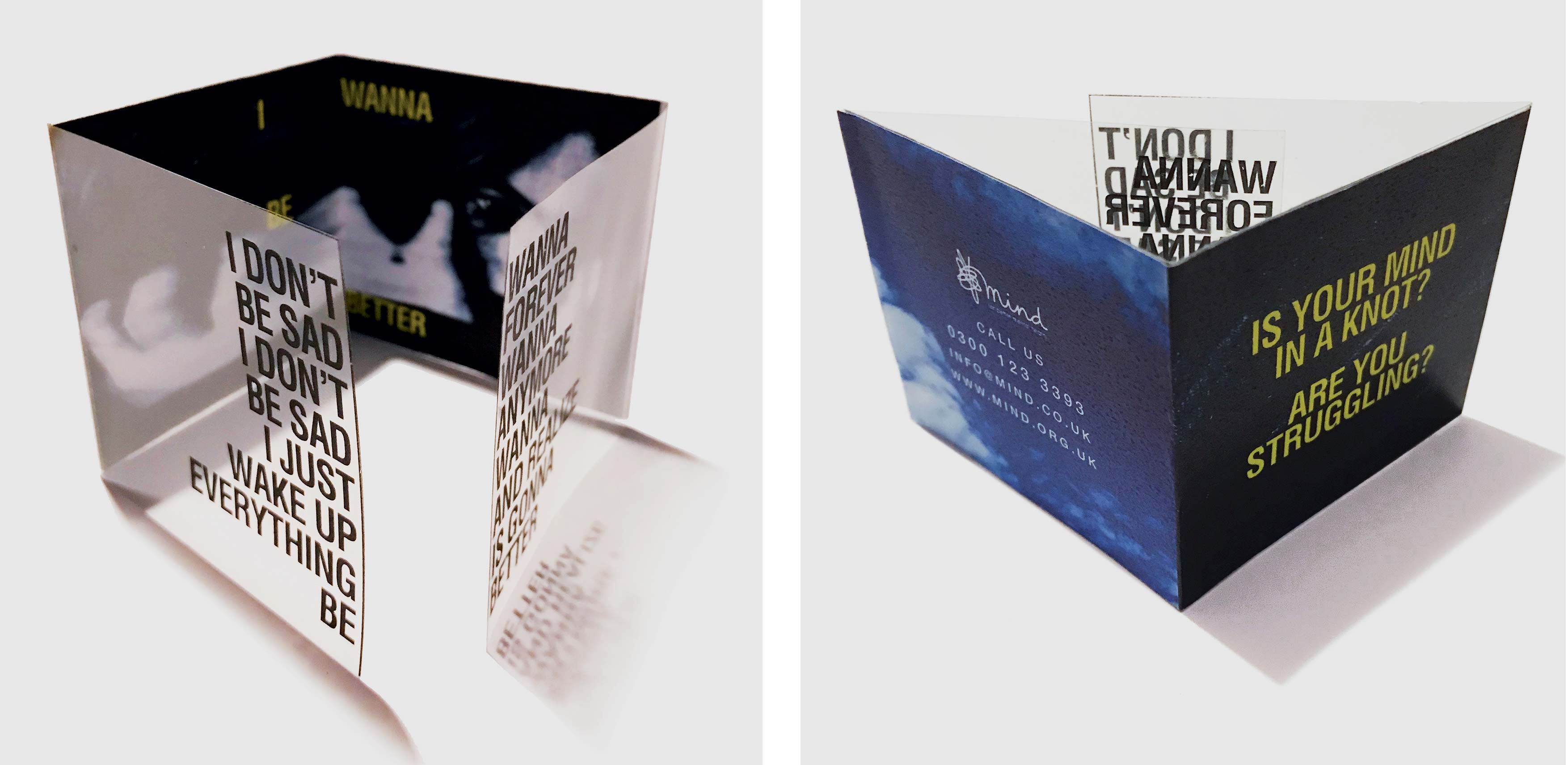
Finally, I designed a small contact information leaflet. I wanted the leaflet to be pocket-sized so the user can always have it on them, whether it's in their bag or pocket. I kept the overall design quite simple, having the negative 'thoughts' message written on the acetate, then revealing the positive message underneath, when opened. This is to give the user some hope, that there is help for them. Even though I have used a lot of dark imagery, for the contact information, I used an image of the sky to represent positivity and the help that the charity provides.
